Hello again. Cardz 4 Galz has started a new challenge. I am hosting this time round, and have chosen the theme of:
Use Stencils
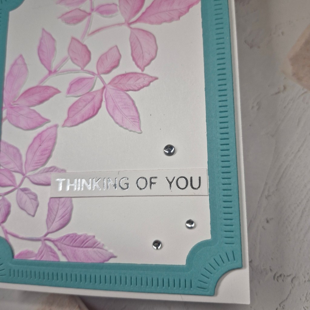
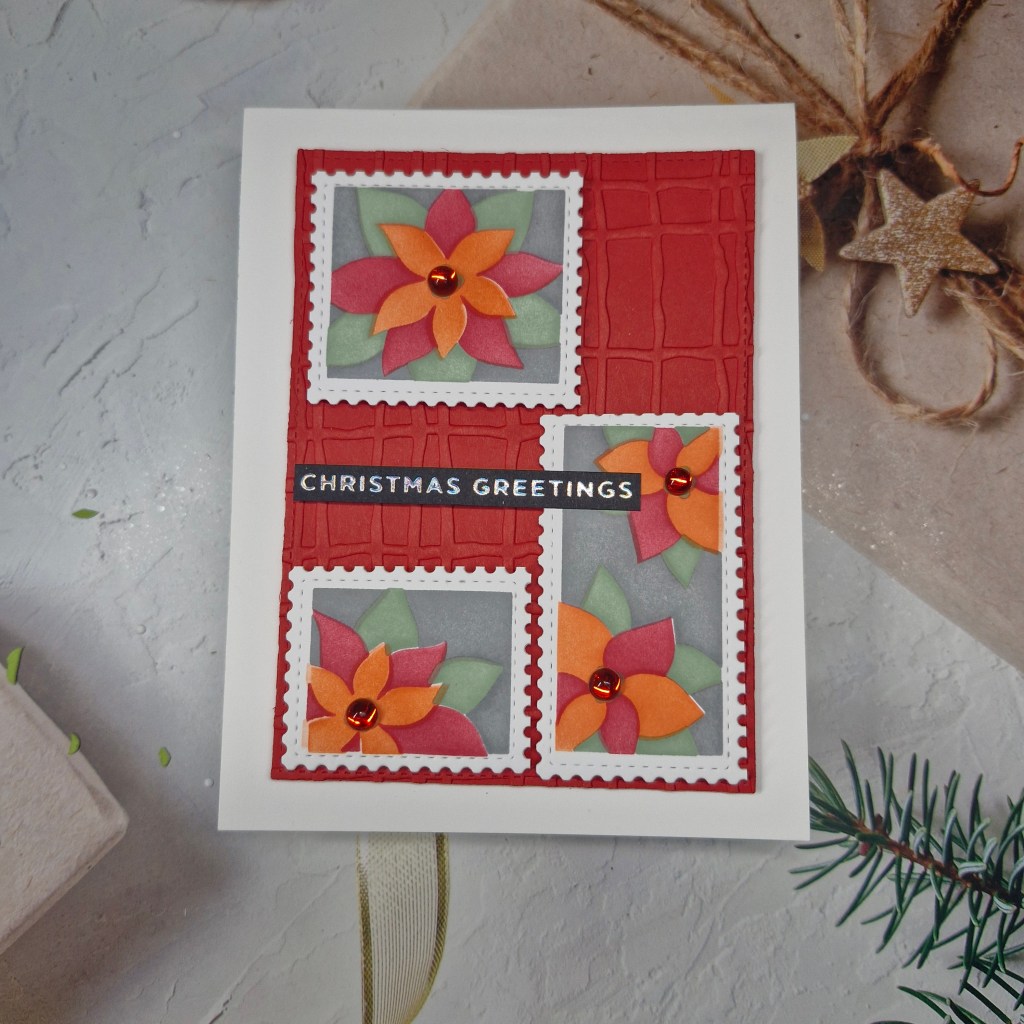
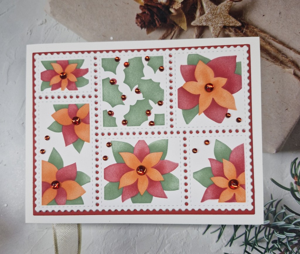
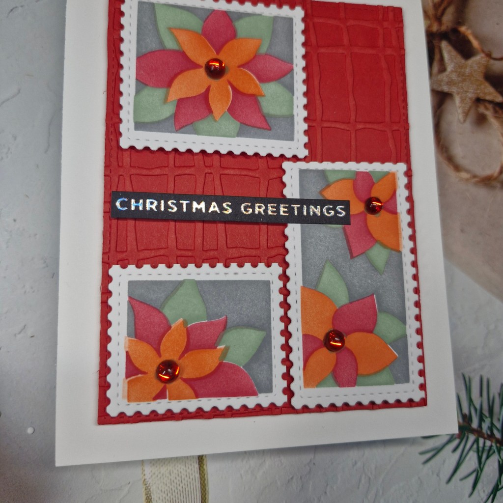
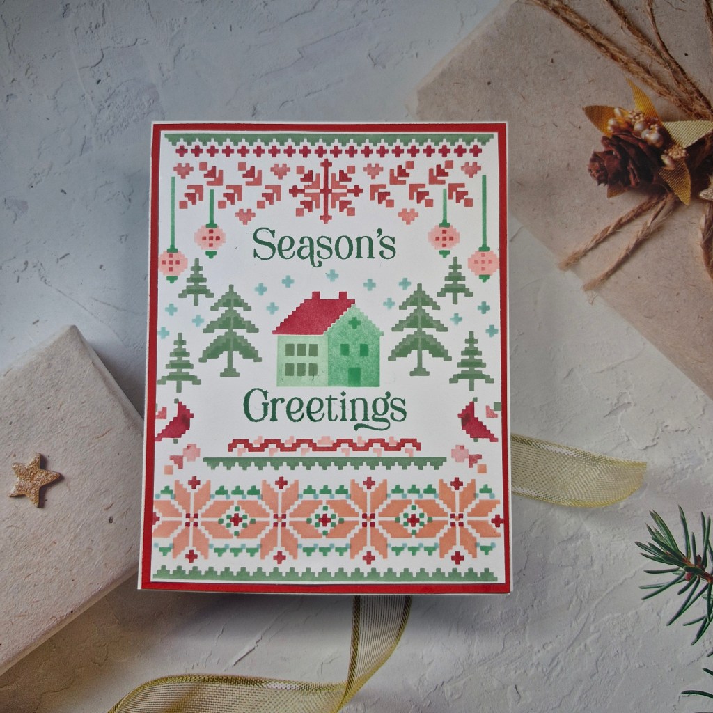
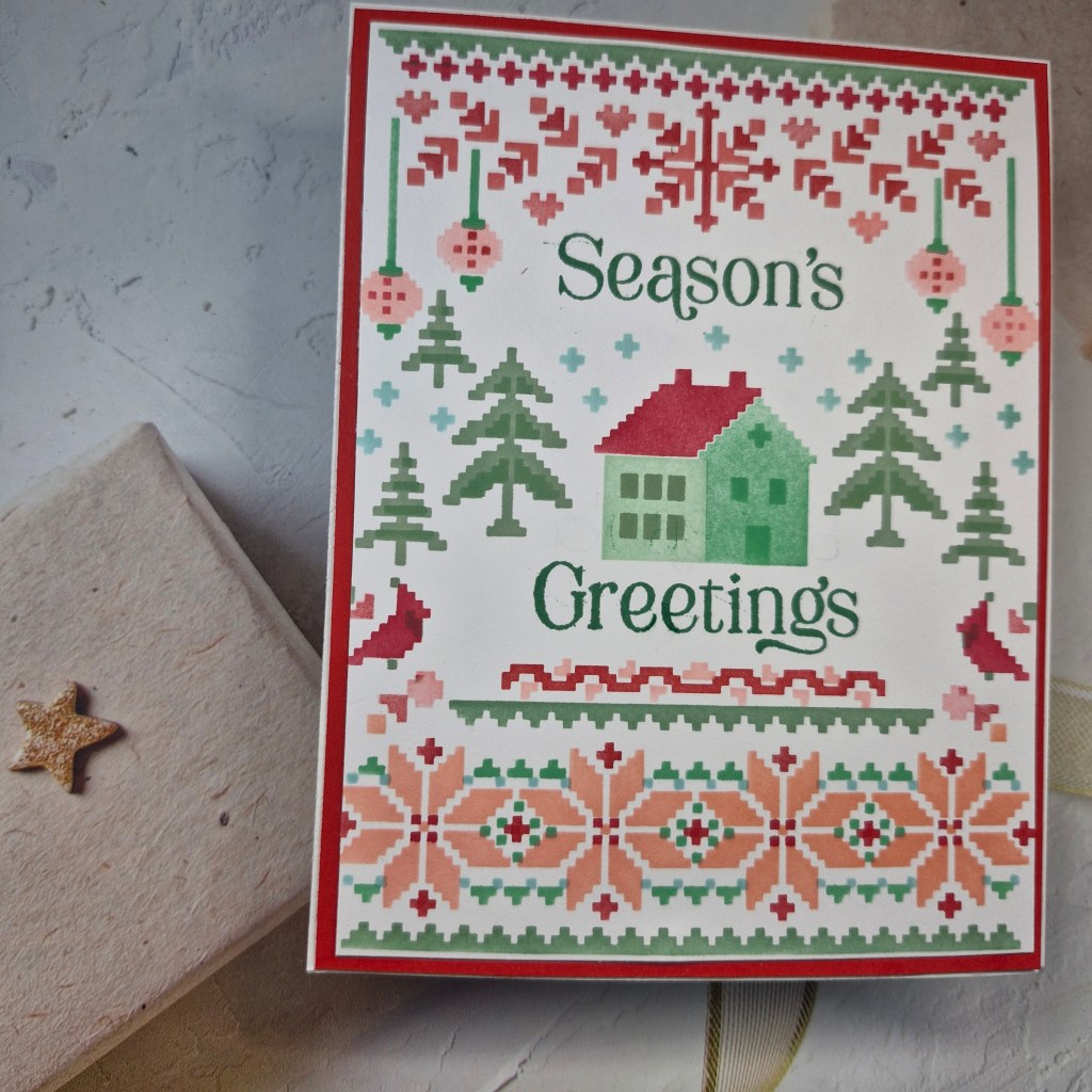
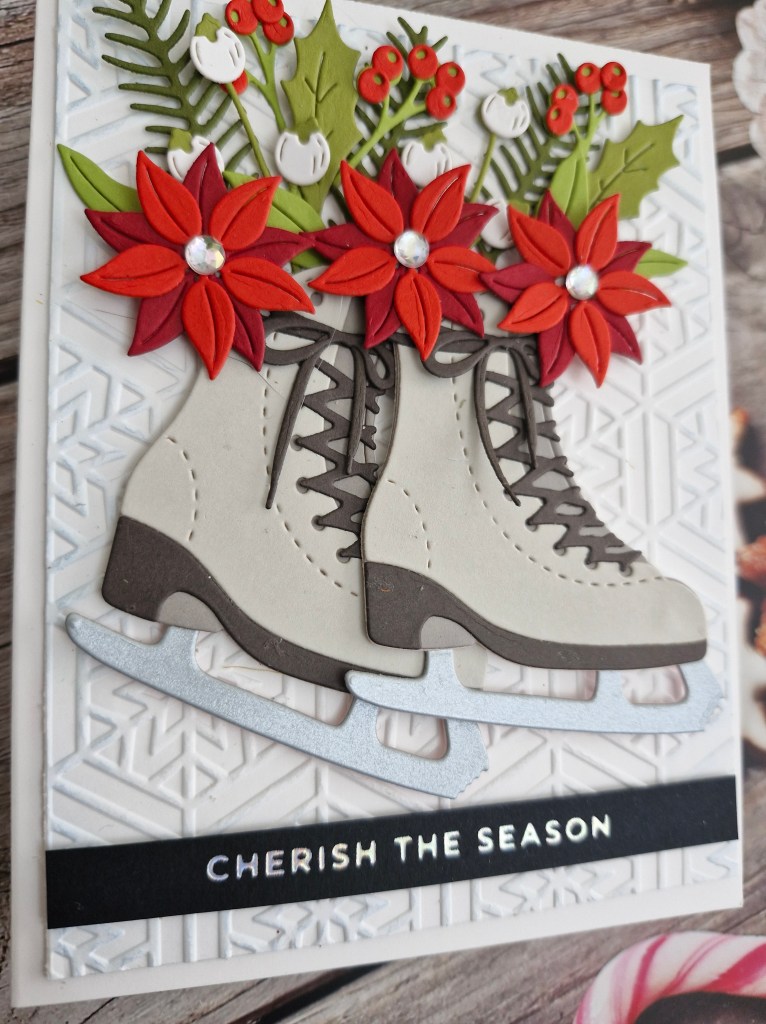
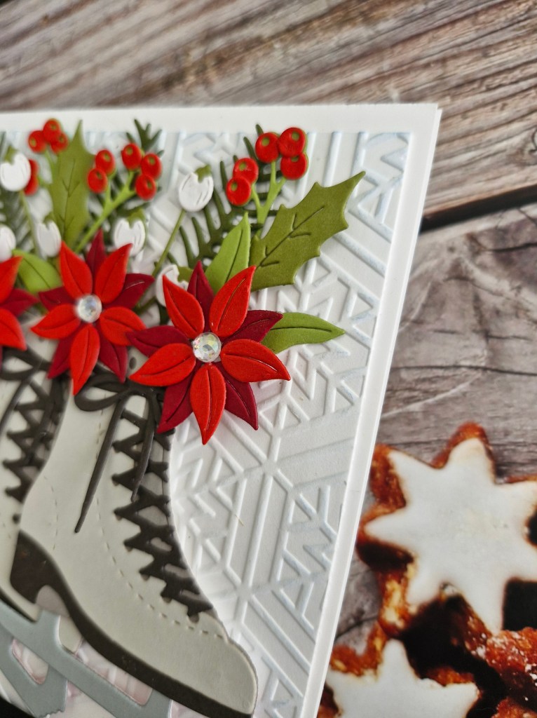
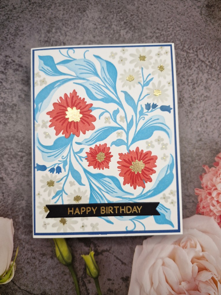
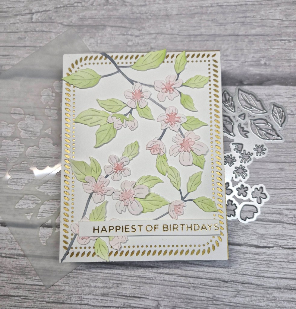
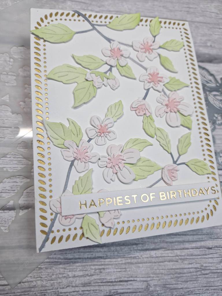
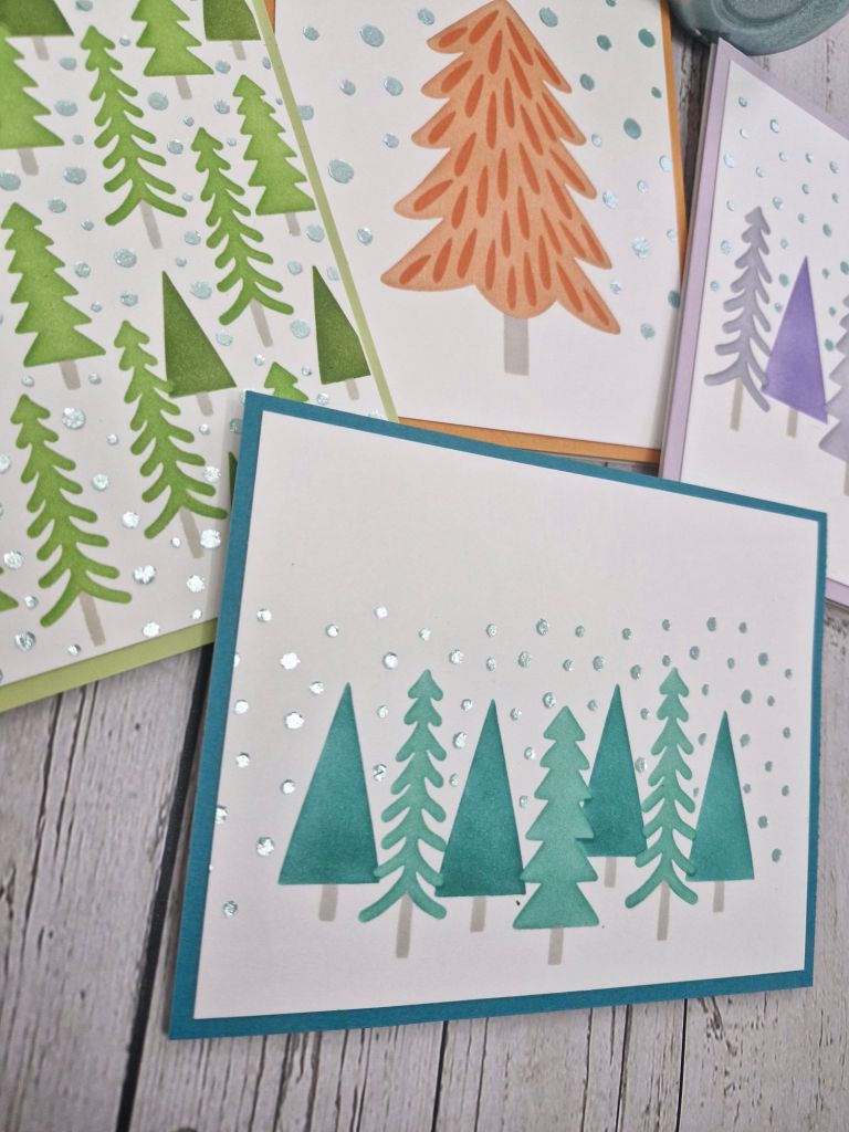
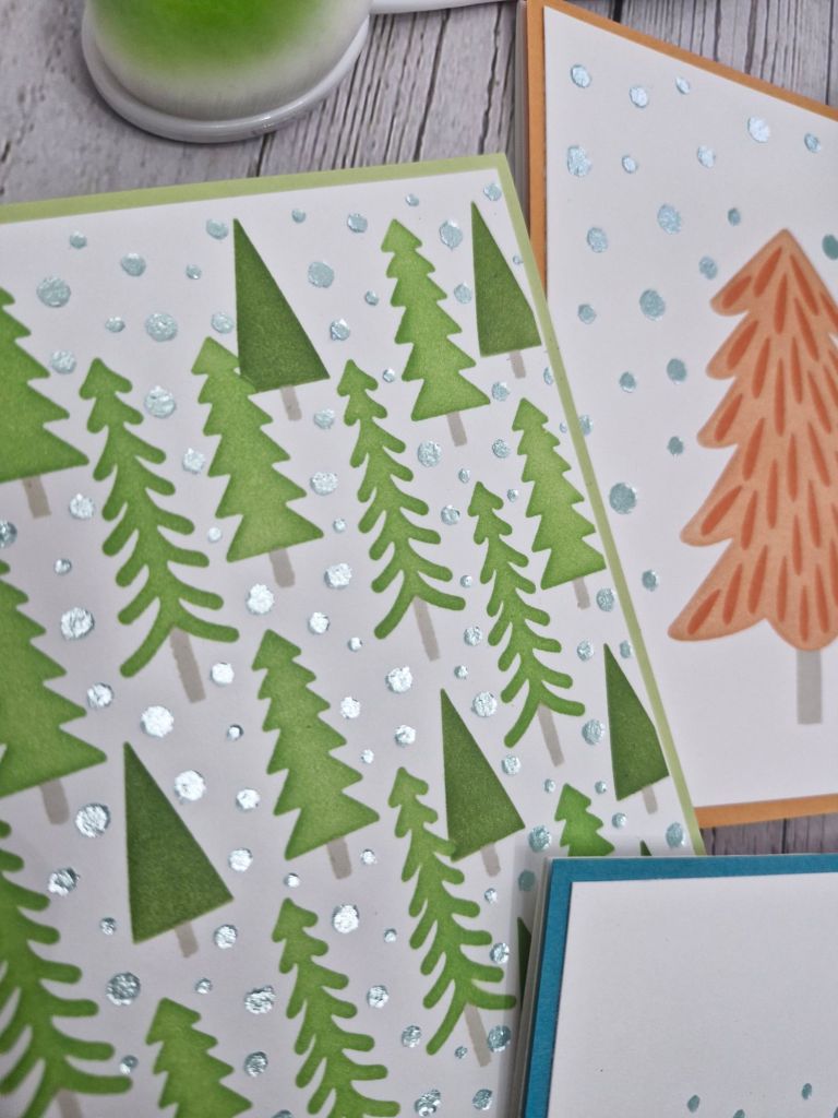
Here is my card:
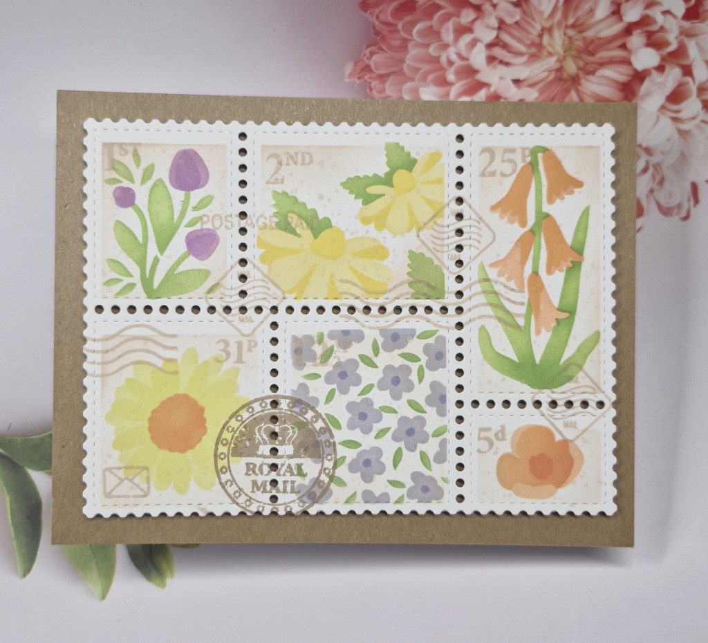
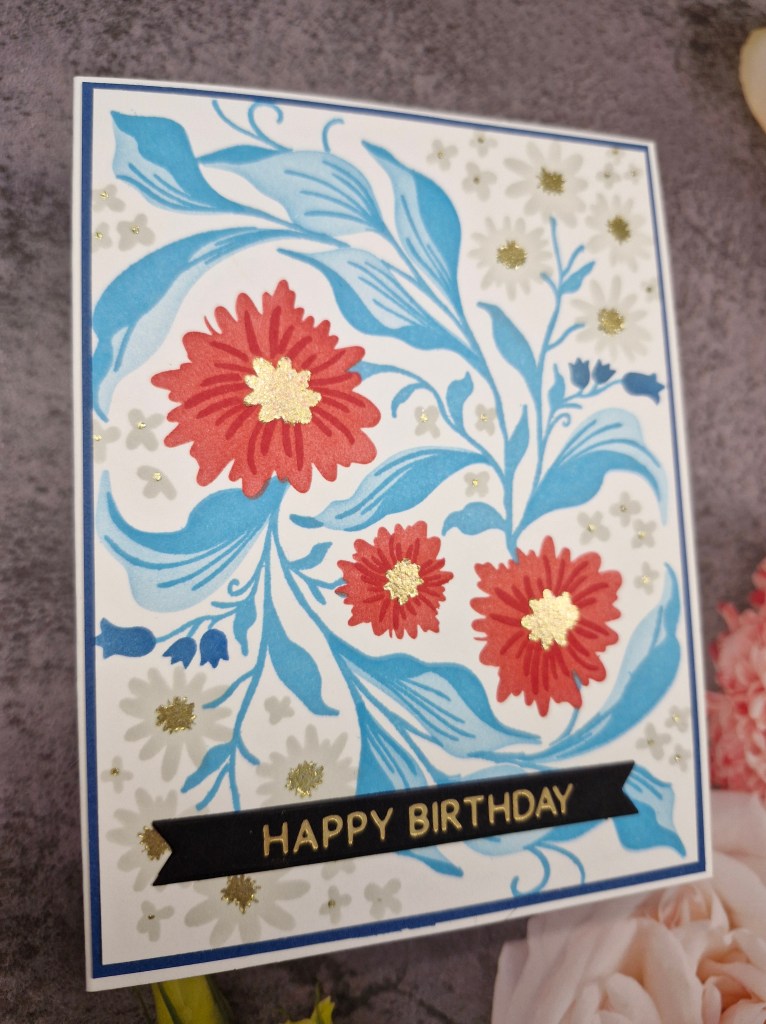
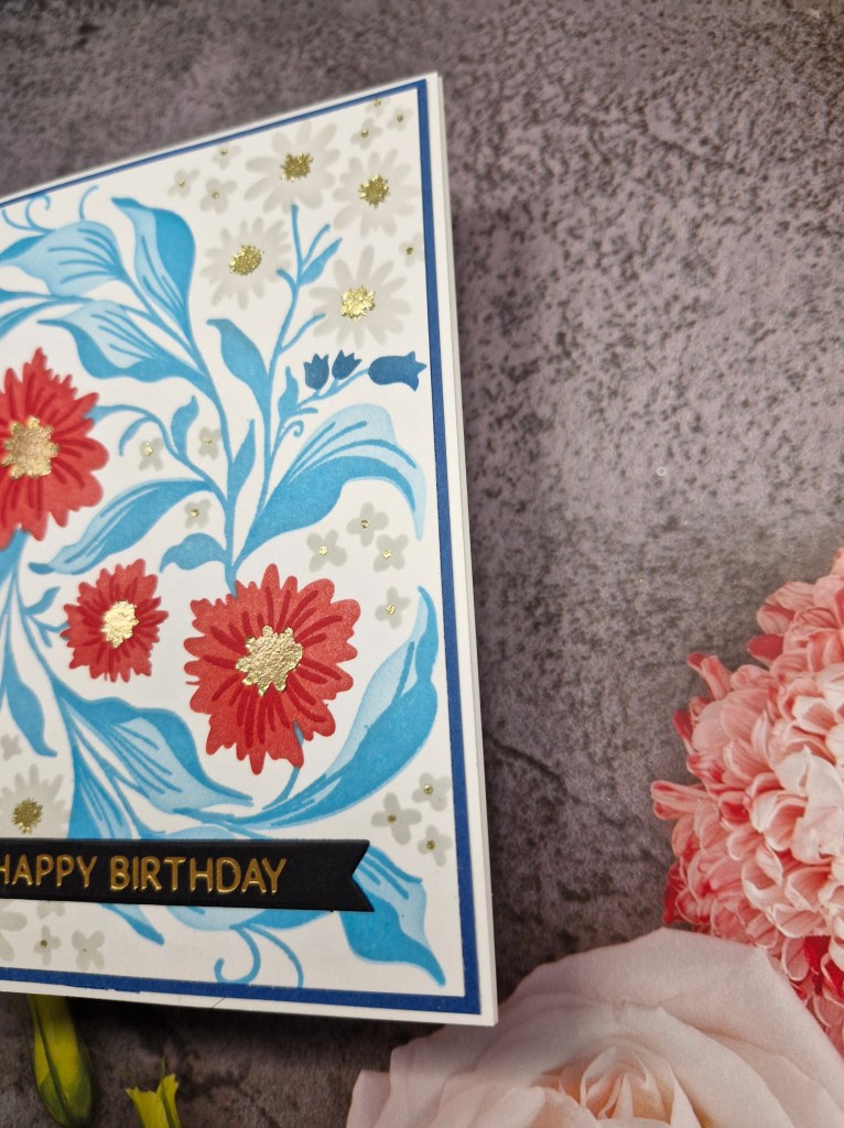
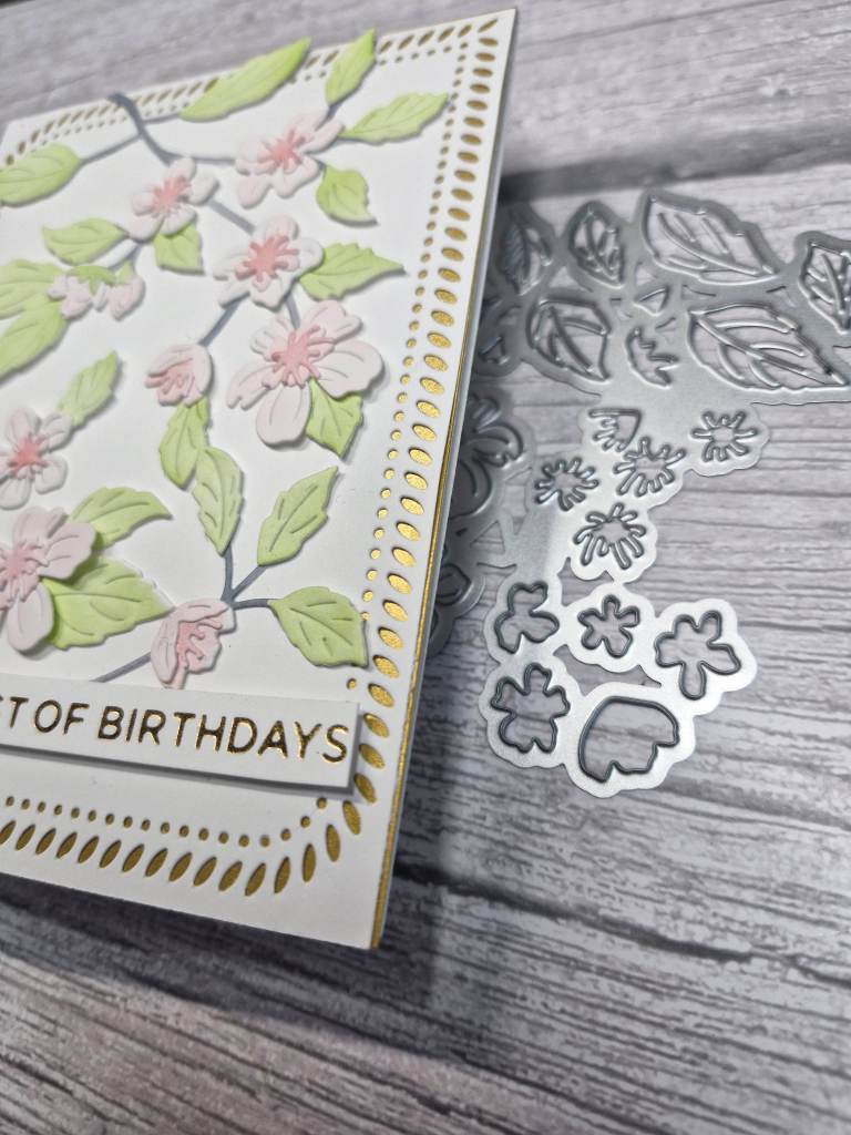
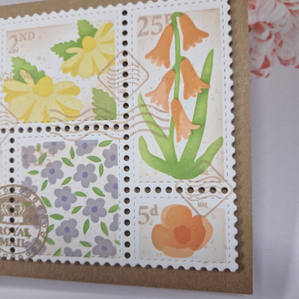
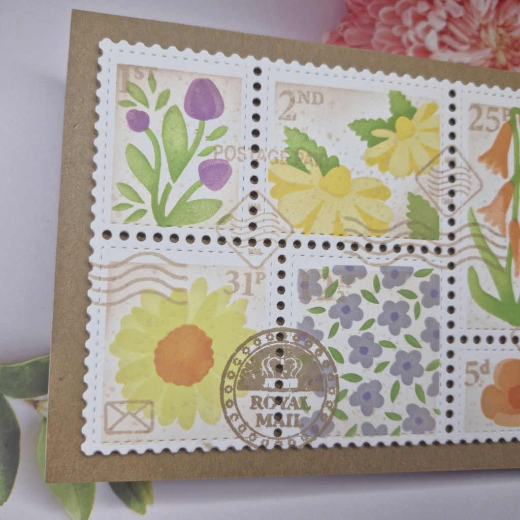
I chose to keep this a fairly simple design, but I did do quite a bit of masking and changing colours on the same stencil layer.
There are three layers to this stencil set, and I wanted each of the flowers to be different colours.
Once the flowers were complete, I then used a small blending brush and some light brown ink and went round the edges of each of the compartments, hoping to create a muted and vintage look to each of the small backgrounds. I then used the same light brown ink to splatter, and also to stamp some of the Royal Mail detail. I think it is great that Waffle Flower Crafts recognises us over here – love that idea.
Once dry, this was then die cut using the postage collage die.
I hope you can come and join us with your creations using stencils. xx
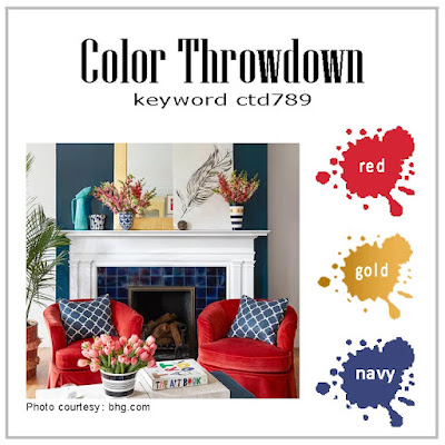
I shall be entering the following challenges:
Ally’s Angels – anything goes
Beautiful Blossoms – flowers/florals
A Perfect Time To Craft – anything goes
Ellibelle’s Corner – anything goes
Stencil Fun – use stencils – option of hello/winter not taken