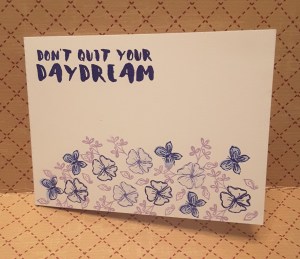
Happy Birthday

Good morning everyone. I am not at work until this afternoon, so I thought I would finish the card I started yesterday. As always, I gain inspiration from challenges, and – as always – I leave it to the last minute on many of them.

I have had the colours from Color Throwdown and the sketch from Freshly Made Sketches in my head since they went live……and yesterday got down to making the card. Well, after I had spent a good few hours at a craft show in Doncaster Dome, and bought even more goodies.

I started with a 6 inch square white card base, and added a slightly smaller navy layer, which I embossed with my Crafters Companion Textures folder ‘Rain’. I then die cut some pale pink card from Creative Expressions with  a Sara Davies Signature Collection die – an edger die from the ‘Together Forever’ range, which added the curved intricate edge.

After sticking that down to the top of the blue embossed layer, I added another blue layer which I had die cut the ‘Happy Birthday’ panel. Again – from Crafters Companion Create-a-card range. I think the light pink makes the sentiment stand out quite nicely.

I was thinking of gold for under the sentiment, but then I bought the Altenew stamp and die set yesterday – ‘Extra Special’ – and decided to heat emboss the main flower onto blue card with gold embossing powder, to act as the downward tag part of the sketch.

I then added some gold speckle dots – couldn’t resist – and stuck them all down on the card base. I stuck them all flat, with very little dimension, apart from the layers themselves.

So different from the most recent card of mine, as very little stamping – just the main flower element.

I photographed the card outside again – in-between rain and rain and rain – but still natural light. I’m not sure if the card came out very effectively, but I wanted to ensure you could see the shine of the gold embossing.

I was Skyping my sister in Quebec yesterday, and we were talking about backgrounds and natural light, and as it is summer (apparently) and natural light is here for longer in a day, I may try more techniques in the future. Perhaps adding some extra interest with dinner plates, or pieces of wood………or some of the items I have used to make the card.

I will be entering into the following challenges:

Freshly Made Sketchessketch

Color Throwdownnavy, light pink, white, gold,

4 Crafty ChicksBirthday

Just Us GirlsDie-cuts


Sketch and colours

Hi everyone. Today’s couple of cards are inspired by CAS Colours and Sketches. For this card, you had a sketch to follow, and also a selection of colours from Stampin Up. I didn’t have all the colours they suggested, and used Lost lagoon, Baja Breeze, and Watermelon Wonder instead. I hope they match enough for the challenge…….

I began with a 6 inch square white card base, and added a die cut from Sizzix/Tim Holtz ‘Scribbles and Splat’. I die cut the scribble twice and added it as a band as per the sketch, and decided to use the piece of card I used for die cutting as another band on a similar card – waste not, want not! I stuck the actual scribbles down using my little Xyron so I didn’t get glue all over the place.

For the main piece, I stamped the main flower from Stampin Up ‘Sunshine Sayings’ in the two different colours, and added some smaller flowers as fill-in from Catherine Pooler ‘Amazing Floral’ stamp set. I used all three colours at some point in the stamping.

The sentiment is from the same Catherine Pooler stamp set, in black, as I wanted a contrast to all the colours used, and I feel the flowers actually stand out more with the sentiment in black.

I think I’m getting the hang of less and less layers and embellishments, but I do like to revert back occasionally.

I will be entering the following challenges:

CAS Colours and Sketchessketch and colours

QKR Stampedeanything goes

Artistic Inspirationsanything goes with option of flowers

A bit more time to craftanything goes

Mix it up challengeanything goes with option of stamping


Love is all around

I’ve gone all ‘lovey dovey’ with this card, haven’t I? The inspirations for this card was from Just Us Girls challenge, and Cardz 4 Galz. I tried to emulate the hearts design, and whilst I was looking at that I was singing (in my head, don’t worry about it raining all day tomorrow!) ‘Love is all around’ by Wet, Wet, Wet. Even now, I know all the words. I have just done a quick Google – and it was released in 1995! 1995! Good grief. 22 years ago. Doesn’t time fly?

For this card, I used Centura Pearl card stock for all the die-cutting, as well as the base card. The embossed layer is a Spellbinders M-Bossability folder ‘Hearts’ I have had for many years, and is a go-to folder for the more romantic cards make – weddings etc. On one side you can emboss the smaller hearts background, and the other side is the dotty hearts background. A very versatile and useful folder.

The hearts are from a Sue Wilson fillables collection, a range of three heart dies and inners – ‘Jewelled,’ ‘Laced’, and ‘Fluttering’. I have mixed and matched all three of them to create each of the hearts.

I attached the three hearts with some Pinflair glue Gel, as I like to move it around when I have it on the card, and attached the single heart with some foam pads, as I knew exactly where I wanted that to be.

I will be entering one of these cards into the following challenges:

Just Us Girlsphoto inspiration

Cardz 4 Galzinspired by a song

Die Cuttin Divasanything goes

Watercooler Wednesday challenges anything goes


Shiny Christmas

It’s a cooler day here in Chesterfield UK, so I’ve decided to do a Christmas card. I have no idea where the logic came from in that sentence. It just seemed to fit. There are a few challenges out there with the theme of Christmas, so I’ve been playing with some of my crafty goodies.

I have also tried another way of taking a photo. What do you think? My sister sent me a link to a blog by Yana Smakula – I think she is bored with my previous background!! – and I’ve had a play with out house wall and a stool outside…….do you think it works better?

It actually took me a good couple of hours to conceptualise (what a word!) and come up with this. I wanted to do snowflakes, and I wanted them laying over the edge of the main piece of card, but other than that I just played.

I started by die cutting all five of the snowflakes from Sizzix/Tim Holtz ‘Paper Snowflakes’ – randomly – from a piece of white card.  After die-cutting the snowflakes, I then stuck a piece of double-sided sticky sheet on the back, which meant I could add some gilding flakes to the apertures left by the die cuts. (I’ll be using those on another project)

I applied IndigoBlu ‘Yorkshire Dales’ gilding flakes as I liked the multi-coloured effect these created. After adding the flakes, I smooshed them down and then embossed the sheet with a Sue Wilson 8 inch square embossing folder called ‘Snowflake Mosaic’. Then I decided what size I wanted the actual card to be – 8.25 inches by 6 inches. (Pre-bought card bases)

To follow the sketch from Atlantic Hearts Sketch Challenge, I then cut some circles from the MFT ‘Stitched Circle Frames’ out of the same ‘greeny’ card I used on my jungle themed challenge. I just love this colour – kinda shimmery, olive/greeny/browny.

I attached the circles to the bottom left of the card, leaving one of the smaller circles out for added interest so the circles weren’t so boring, and die cut one of the snowflakes out of Stampin Up glimmer paper, sticking that down with one of their dimensionals.

I cut the circles and snowflake to match the edge of the card, then peeled off the other side of the double-sided sticky sheet (already on my white card if you remember – and stuck that down to yet another layer of the greeny card, then onto white base card.

The sentiment is an X-Cut die, which I cut out three times from card with double-sided sticky sheet on each layer to make it easier to stick one on top of the other, then added to the card.

From the front, the sentiment isn’t quite that obvious – which I wanted – and doesn’t detract from the snowflakes, but turn it to the side and get the shine from the gilding flakes – I think it works well.

I shall be entering this card into the following challenges:

Altantic Hearts Sketch Challengesketch

Watercooler Wednesday challengeChristmas

Addicted to Stamps challenge Holiday

Mix it up challenge anything goes option embossing

Christmas Cards all year roundprecipitation (snowflakes)


Sparkly Dragonfly


Hi there, I have been playing again. I actually haven’t stamped very much on this card, as I just felt the need to die cut and emboss. I took the opportunity to use the Detailed Dragon fly Thinlits from Stampin Up. I also have the matching stamp set, but today just used the die.

I started with the sketch inspiration from Mojo Monday, as I liked the clean-ness of this sketch, leaving a lot open to interpretation. I also had some of the Lawn Fawn ‘Narwhal’ card left over from the previous blog post. I think this grey card is a really nice colour, and decided to emboss a grey panel with the Sue Wilson ‘Climbing Vines’ embossing folder, to go on top of an embossed white panel. I embossed them both together, so the pattern flowed across both the colours.

After sticking that down to a white card base, I die cut the large dragonfly out of white glimmer paper from Stampin Up, and decided not to add any other layers to it, as I think this glimmer paper is gorgeous enough on it’s own.

The three strips I cut down and stamped with a line of hearts in white ink, layering them down as per the sketch.

The main shape is also from Sue Wilson ‘Porto’ die set, which I cut out of white and then in grey, off-setting them so you could see the white on the grey background, and grey on the white background. The embossed detail is from the same die set – just embossed and not cut, to add some detail to an otherwise blank tag.

I used Collall silicone glue to the back of the tag, as I could then insert the strips and play around with the positioning before it set solid. I often do the when I want to add items underneath another item, as it gives you plenty of time to position.

The dragonfly I stuck down with Cosmic Shimmer glue – my favourite go-to glue of all time – but only stuck down the centre body, bending the wings slightly for more dimension.

I shall be entering the following challenges:

Mojo Monday Sketch

A Bit More Time to Craftanything goes

Crafty Catzanything goes

Colour Crazy Craft Challengeanything goes

Monochrome Magicanything goes monochrome


Inspiration from photo

20170407_200020

This evening I have been having a play with some of my more vintage or shabby stamps and papers. I was looking for something to make for the Inkspirational challenge, and decided I wanted to go away from my colourful recent posts, and concentrate on more of a monochrome look.

I began by thinking of Tim Holtz dies and stamps, and remembered the ‘Mixed Media’ dies I bought a while a go and never used. I am sure you will have bought things ‘just in case’…..well now I have a reason to use them.

I started with an 8 inch square Kraft card base, and added a piece of patterned paper from a Be Creative paper pad – also that I have had for quite a while. I cut the corner die from the paper, for a diamond effect, and stuck this to the base card. I also didn’t want the paper to be the same size, and cut off a couple of inches to leave a Kraft border. Once I had stuck the paper to the card, I curled and rolled the top right corner, and slightly curled the bottom right corner, to create more interest.

The sentiment is from an IndigoBlu set ‘Take The Time’, and the large clock is from Tim Holtz collection from Stampers Anonymous ‘Vintage Things Blueprint’. I used the Versafine black ink, and then distressed the paper with Frayed Burlap and Old Paper to create a more vintage feel.

The small clock was stamped using Frayed Burlap and came from another Tim Holtz Stampers Anonymous set called ‘Little Things’, whilst the tree/vein effect came from an IndigoBlu set ‘Nature 1’ again stamped with Frayed Burlap.

I then distressed the side panel and main paper panel again with the inks.

I played and experimented a little with this card, using quite a few stamps from different sets, when I usually stick to one or two sets at most – maybe main image with a sentiment from another set.

I will have time over the weekend to have crafty playing, so I am sure I will be showing you what I have done.

Brusho and butterflies


I’ve had a little play with my Brusho’s! I don’t know if this is what you are supposed to do with them, and I don’t know if this is the effect one hopes to achieve – but I like it! Such a little burst of colour. Like magic when added to water.

The inspiration for playing with my Brusho’s came from the Addicted to Stamps and More site. There is an inspiration photo which immediately brought to mind the small set of Brusho’s that I have. I haven’t really experimented with them, but thought I would give it a go.

I tried three techniques, and actually like them all, for different reasons. The first thing I did was to cut some of my Crafters Companion water-colour A4 card into 4 pieces. That way I could experiment with four different methods at the same time, rather than try one, and complete the card, then another etc. I like to look at the different outcomes all at once, then decide what I want to do with them.

First technique: wet the water-colour card front and back, then drop my Turquoise Brusho onto it very gently, slowly, miniscule fleck by miniscule fleck – it still burst all over my card! Then my card started to buckle, then the colour was running to the edges…..so I took my piercing tool – which I use to poke out the bits from intricate dies – and pushed the middle down, to keep it as flat as possible. I wanted the colour in the centre of the card, not the edges. This is the piece of card I used to cut my Tim Holtz Butterfly Duo out of, and embossed those same two butterflies with the matching embossing folder. I then added those butterflies to a piece of white card, and drew the antennae on with a black gel pen. I will think about adding a sentiment, but actually quite like them as they are.

Second technique: I dropped flecks of Turquoise Brusho onto dry water-colour card, then sprayed water onto it. Only a few drops of water at a time, again very sparingly, so I could try to determine where the colour and water was going to go. It didn’t quite work out that way, as the burst of colour really is very dramatic, but I liked the effect anyway. I kept some of the areas drier than others, as I like the effect of the Brusho grains when they are not completely saturated by water. I then used the same Tim Holtz Butterfly Duo die and embossing folder but with white card, and adhered the butterflies plainly and simply onto the spattered blue card.

The third technique was to stamp and emboss a butterfly and floral element from an IndigoBlu stamp set called ‘Nature 1’. This is a lovely stamp set, which has clouds, and grass, edge of a tree, and a gorgeous sentiment. The butterfly from this is quite solid – what I wanted – so I stamped the butterfly and the flower/thistle/weed (don’t know what it is!) with my Ranger Perfect Medium, embossed it with detail white embossing powder from Cosmic Shimmer, then wet the card and dropped my turquoise Brusho onto it. This time, I wanted a more ‘washed’ effect behind the butterfly and flower, and saturated the grains very well, let them run all over the embossed images, just so the image would be highlighted by the background colour, as the embossing resisted the colour of the Brusho, as expected. (Was that a really long sentence? Did I waffle on a bit?)

I then added some Tonic Crystal Drops in Midnight Blue to three of the edges, stamped a sentiment from the Altenew stamp set ‘Birch Land’ and adhered that with foam pads.

I have four other colours of Brusho’s and I feel I may be making similar cards with similar effects in the very near future. However, I may also have to do an internet and YouTube search for hints and tips when using these – but still going to have fun experimenting with them.

I shall also be entering one of these cards into the following challenges:

Just add ink

Crafty Friends Challenge Blog


Clean and Simple Sketch

20170401_214152

A quick and easy blog post for today – working all week again, so not sure how much time I’ll have in the evenings – depends on what time I get home and what hubby wants for tea……..!

I’m having a go at the sketch challenges at the moment, and am struggling with keeping them clean and simple – and think I’ve been a little too clean and simple with this card. I thought I’d post it anyway, as I actually do like how it turned out. I like the simplicity of the flower and sentiment, and the contrasting colours of the two base layers.

This sketch was from CAS Colours and Sketches and I think I’ve achieved what was asked……we shall see.

The base card is from Create and Craft – a Topsy Turvy card I have a stock of, with the inside of the card being a lighter blue. The next layer is almost like a burnt orange, with a lighter reverse side, but that lighter side on this piece is a little ‘wishy washy’. I think it’s a pink – but quite bland. Anyway, didn’t use it so it doesn’t really matter.

The white card is from Stampin Up, and I stamped the ‘Best Thoughts’ flower in basic grey, also from Stampin Up. The sentiment was cut out of Lawn Fawn Narwhal card, after I had attached some double-sided sticky sheet to the back of it. I was thinking of using my Xyron again – but the sentiment is quite long – almost 6 inches, so thought it would be a waste. The double-sided sticky sheet worked very well.

I admit this is a very simple card, but I will probably do it again, using different colours for the base card, just to see what effects I can create – some pastel colours, some maybe black and white cards. I may even try colouring – you never know……


Cute Sketch card


20170401_204528

It seems I am having a cute and colourful card making weekend. After yesterday, I was thinking of all my card stock which was bright and colourful – and I have a lot. I am trying lots of new styles and techniques at the moment, and as well as messy crafting or mixed media, I am starting to use some dies and stamps which are more cute and fun, which means I can use any colour card I want to represent anything at all.

Today, I have taken inspiration from a sketch challenge from Atlantic Hearts Sketch Challenge, and had a play with coloured card. I recently purchased a set of dies from Hochanda, a UK craft channel. I believe it can be watched around the world, but really not sure.

This bundle is designed by Katie Skilton for Sizzix, and includes the dies I have used for this card. This set is called ‘Under the Sea’ – I am sure you can see why! I have also used the sentiments which came in the bundle ‘Tribal Words’.

The base card is 7 inches square, and again used my Sue Wilson Noble Stitched Squares to cut a slightly smaller square out of light blue. I again embossed this with the ‘Rain’ embossing folder from Crafters Companion. I think the rain could represent anything, and this time, for me, it represents bubbles in the sea.

I die cut the whales out of some Create and Craft card stock, which has a toning colour on the opposite side, so I could match the colours without thinking too much about it, and added several other elements from the same die set – the fish and the heart.

The circles, as per the sketch, I used the Lawn fawn ‘Slide on over’ circles. These were designed for slider cards, as the dies cut the circle itself, and cuts out the channel which makes the slider card. This is how I managed to get circles which matched each other, and outer circle rim shapes for the other components required to meet the sketch challenge.

The two solid circles I also embossed with the same embossing folder. I layered the outer circles flat to the card, but raised the other elements on Stampin Up dimensionals. I die cut the sentiments and ran them through my Xyron sticker maker so I didn’t have to fiddle with glue on all the letters. This little machine is great for sentiments and other fiddly elements as it is only 1.5 inches wide, whilst the bigger 5 inch and 9 inch machines are good for the more intricate and elaborate dies for layering.

Deciding where to put each element was a challenge but I like the fun and vibrant end result.

I will also be entering this card into the Just Us Girls challenge with the theme ‘Sea’, and Catch the Bug challenge blog ‘Anything goes’.

Up, Up, and Away

20170401_154412

I wanted to do quite a bright and cheerful card today, and didn’t want to get messy – for a change! The inspiration from this card came from The Colour Throwdown with the challenge to use the colours light yellow, blue, and green. I started thinking about water-colouring and a scenic card, but then also thought that I could use blue for the sky, and take the opportunity to use my Stampin Up ‘ Up and away’ thinlits dies. I have had them for a while, but not used them yet.

I took a 7 inch square white base card, and used my Sue Wilson ‘Ornate Pierced Squares’ to cut a layer slightly smaller. I then hunted through my embossing folders, as I thought I had one which had clouds on it. If I have – it is safely filed away somewhere – I couldn’t find it. So, I then took my Crafters Companion Textures Elements ‘Rain’ embossing folder, and ran the blue card through my Big Shot Pro.

I love the Big Shot Pro, as I can use all my A4 folders, my 12 inch square card/paper, and basically haven’t found any size of die out there on the market I can’t cut with it. I do, however, feel it is not so good when cutting smaller intricate dies – that’s what I have my Big Shot express for!

After embossing the blue card, I then took my ‘Up and Away’ thinlits and cut the intricate hot air balloon twice, then cut the different layers in green and yellow, and then used all those layers and stuck them behind with some detail glue. I then took the cloud shapes in the same die set, and cut several out of white card, and cut a smaller hot air balloon out of white card for my sentiment. The sentiment is from a set from Card-io called ‘Up, Up and Away’.

Card-io do a huge – and I mean huge – variety of smaller stamps ideal for creating your own background, for creating scenes by using each small stamp and building-up the project. They have tiny bugs, larger bugs, clouds, sentiments, trees, bushes, birds, alphabets…..the list is almost endless. Their web site has a lot of inspiration, ideas, and hints and tips. A great range of stamps…….mmmm….now I have found mine again I may have to have a go for another challenge!

Anyway, back to the card itself. The clouds were glued directly onto the blue card, but my balloons were attached with Stampin Up dimensionals.

This card actually didn’t take me very long. The longest time was spent deciding where I wanted everything to go, and which tone of blue and green worked well together. Compared to my last few cards I think this is quite a simple and clean card. I may have to do some more to take for the charity to sell.

I will also be entering this card into the Aud Sentiments Challenge, and 4 Crafty Chicks Challenge.