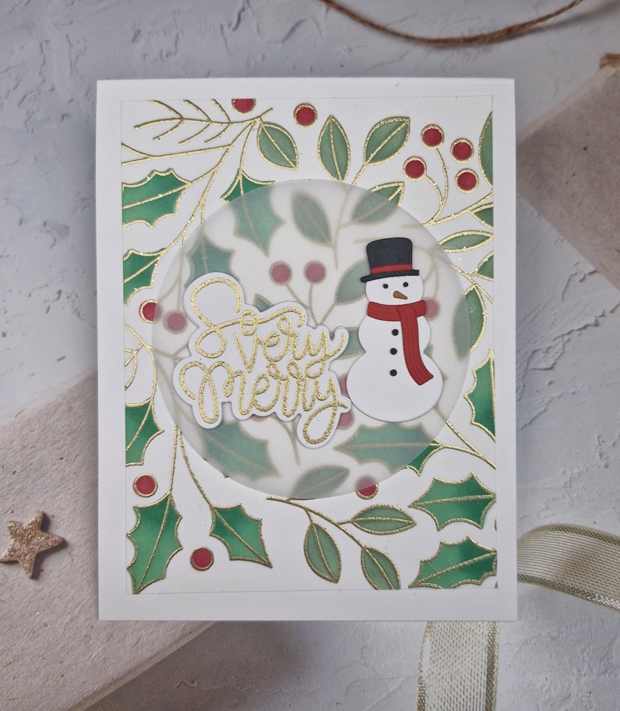
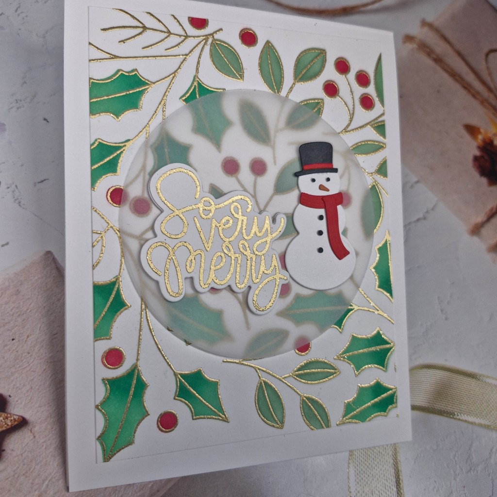
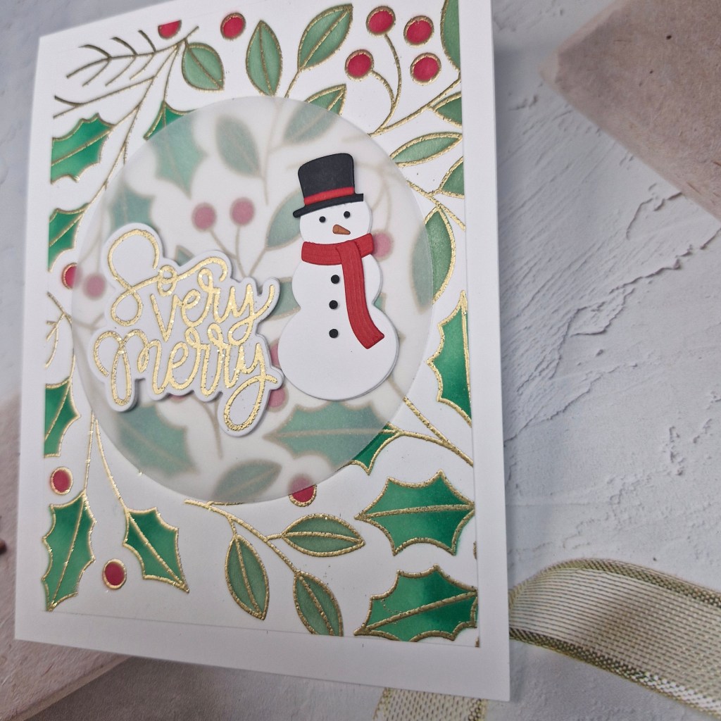
Hello. I received this sweater die as part of a Simon Says Stamp kit, and thought it was adorable, so I had a play with it yesterday:
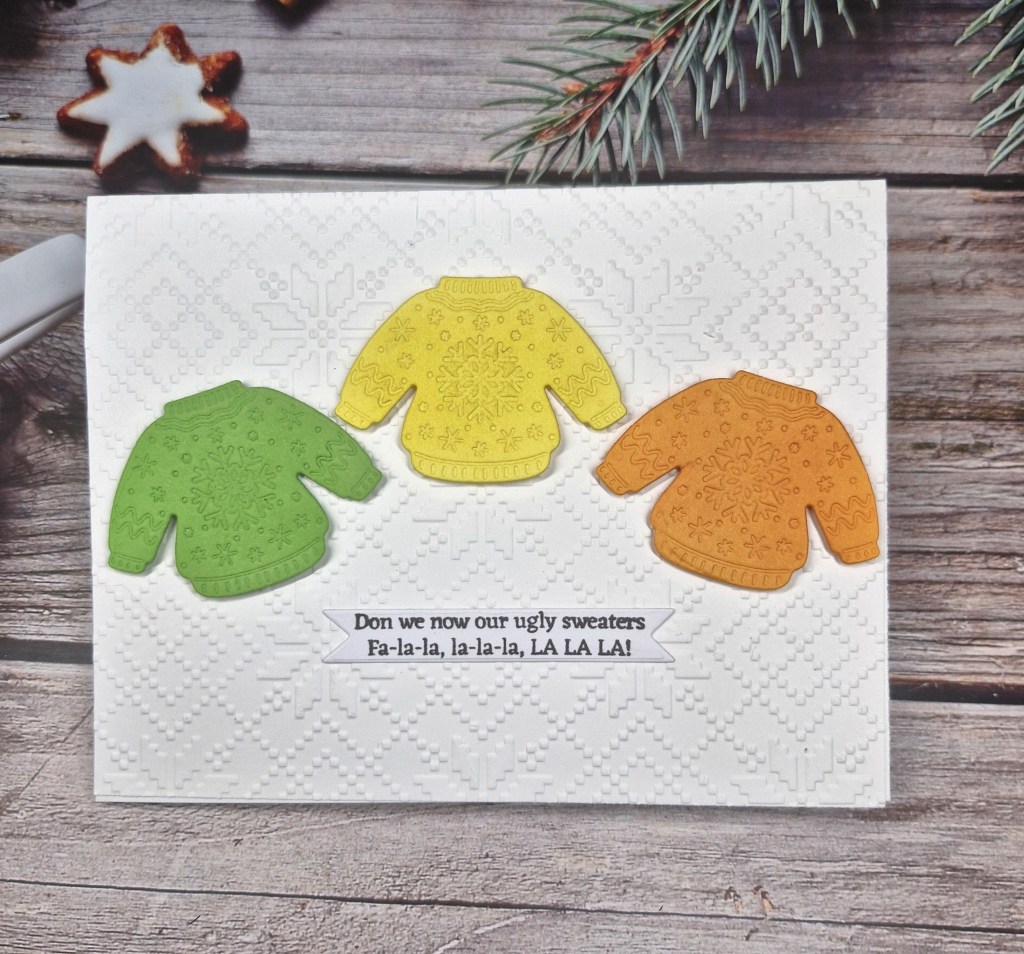
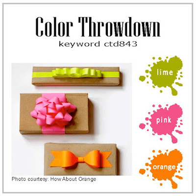
I chose to follow the colours at the current Color Throwdown Challenge, by die cutting the sweater in the colours you see, and I also ran the die cut back through with the embossing mat to make the details stand out a little more.
I also ink blended each sweater in a slightly darker matching colour, to again enhance the details.
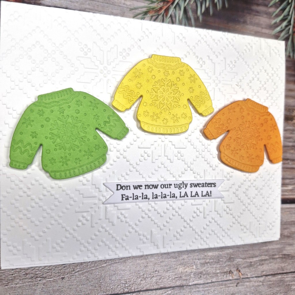
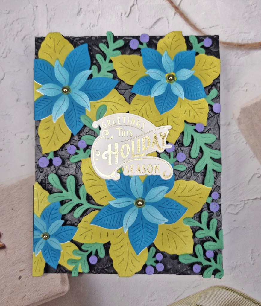
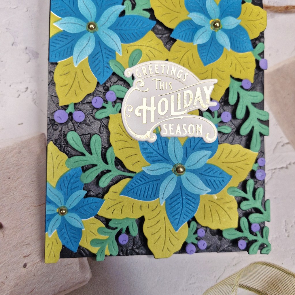
Keeping it fairly CAS – for me anyway – I used a Spellbinders embossing folder to create the background panel, then added the three sweaters with 3D foam.
The sentiment is from a Gina K Designs stamp set – stamped then cut out with a banner die from one of her Master Layouts die sets, glued directly down to the background.
I shall be entering the following challenges:
Sparkles Forum Christmas – Christmas and festive wear
Simply CAS – CAS – holidays/winter
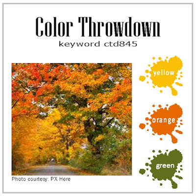
Color Throwdown – yellow, orange, green
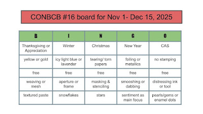
Christmas Bingo – column I – winter/free/snowflakes