Hello again. It is time for the new challenge at The Alphabet Challenge. Dawn is hosting, and has chosen the theme of:
B is for Balls
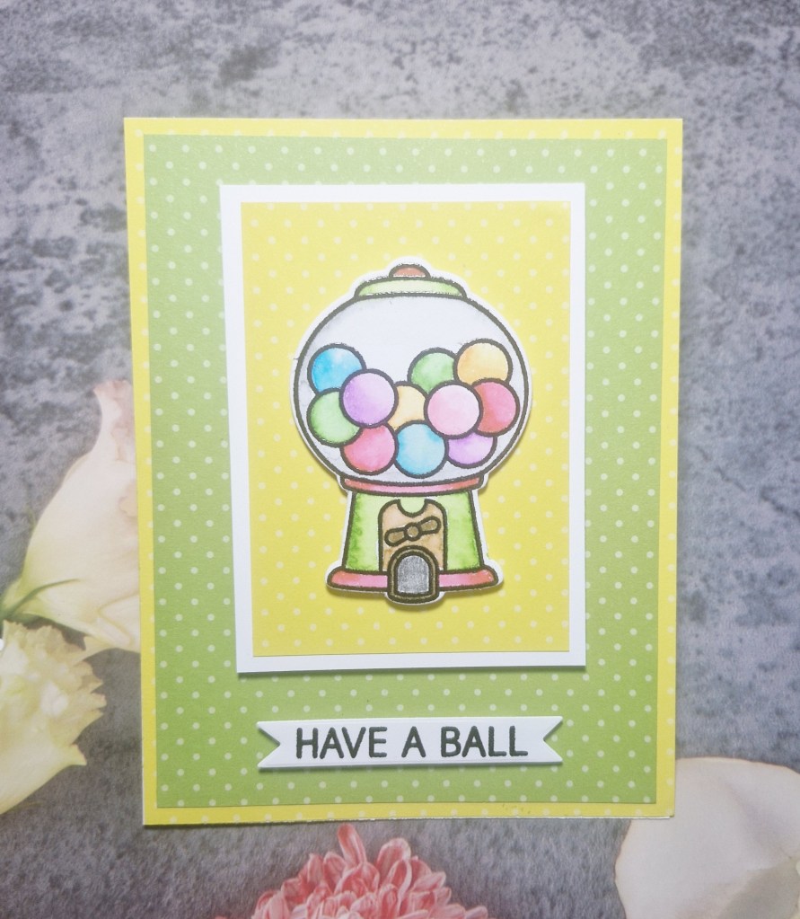
Here is my card:
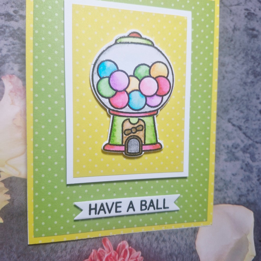
I decided to go with a quirky take on the theme, by using a stamp set from Lawn Fawn. I stamped and heat embossed the image onto water-colour card stock, the water-coloured with my Zig markers. This was die cut when dry, then the sentiment stamped and die cut with a fishtail banner die.
The background is patterned paper, matted with white, and all put together with glue and 3D foam.
I hope to see all sorts of ‘ball’ themed creations in our gallery and hope you can come and join us. xx
Hello again. It is time for the new challenge at Cardz 4 Galz, and Johanna has chosen the theme of:
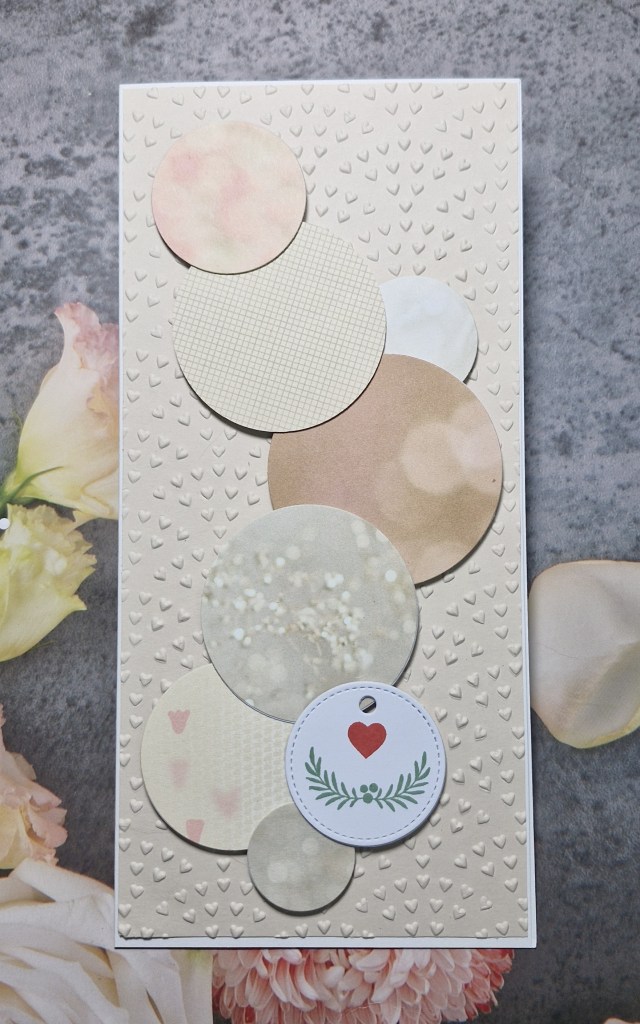
A circle, or anything with circles
Here is my card:
fir this card, I wanted to use some of my patterned paper pieces, and also decided to go with a slimline card base.
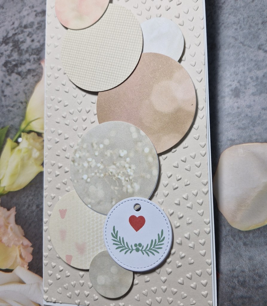
I first die cut several circles out of different papers, different sizes, using Hero Arts nesting circle dies. I wasn’t sure which I wanted to sue, so cut quite a few.
I used a cream piece of card for the background, and used a Spellbinders embossing folder, arranging the circles to suit my eye, which did involve a lot of moving around…
The white circle was cut using a Gina K Designs circle tag, and stamped with a heart and small piece of foliage – I can’t remember which stamp set and which company now.
All the circles were die cut again with white card to make them a little thicker, then attached to the card base with 3D foam, strategically placed so I could overlap them.
I hope you can come and join us with your creations following our theme. xx
Hello there. It;s been a busy week, but I am here with a couple of cards for the new challenge starting at ABC Christmas Challenge. We always have themes for our letters, and this time they are:
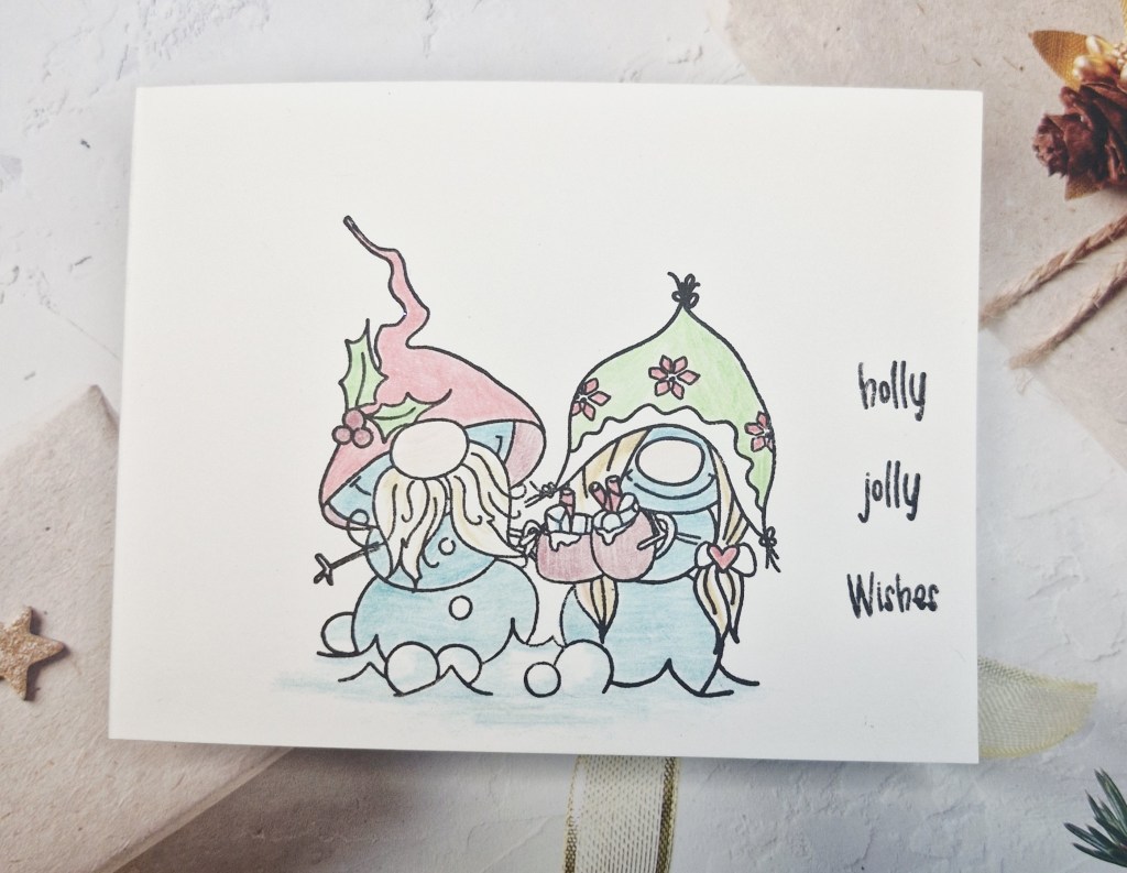
J is for Just Enough (CAS)
&
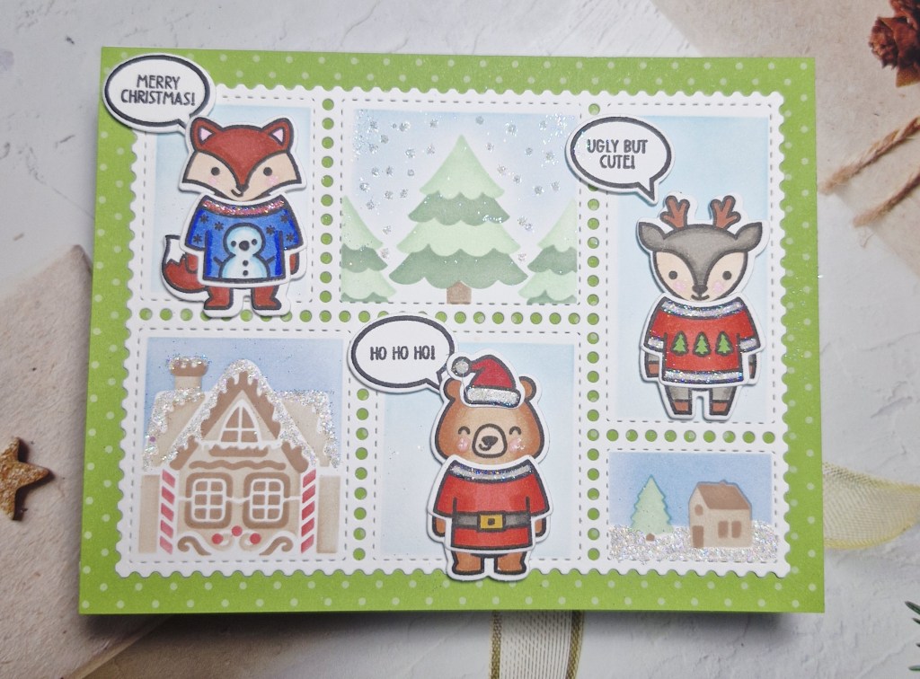
K is for Knitwear
Here are my cards:
J is for Just enough (CAS)
K is for Knitwear
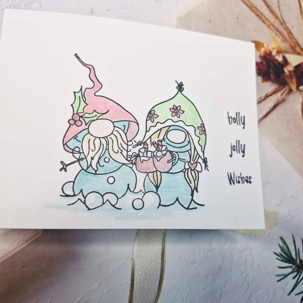
For my first card, I chose a Polkadoodles stamp set, and stamped directly onto the white card base, then coloured with pencils. I find Copics show through on the revers side, and I wanted this card to be one layer, no additional elements, to keep it very purely CAS.
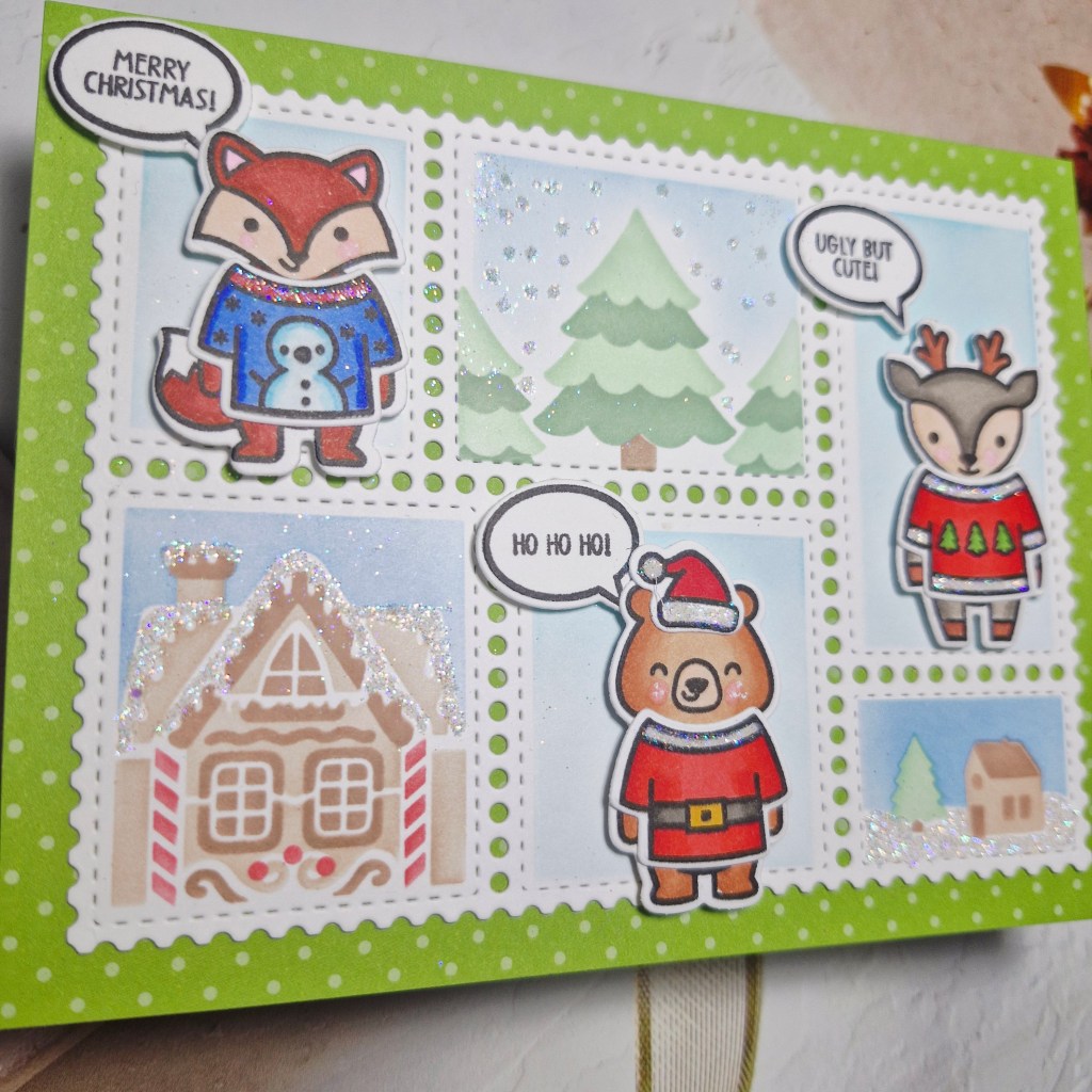
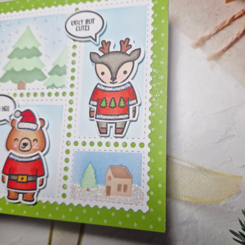
My second card took a little more time. My first step was to stamp the Lawn Fawn critters, then colour them with Copics, before die cutting them out. The sweaters were also stamped, coloured, then die cut, and attached to the critters. The edges of the sweaters I also added some Lawn Fawn Prisma glitter for a little more sparkle.
All of these stamps came from the same stamp set – ‘Ugly & Bright’.
The background is some patterned paper from Heffy Doodle.
I used the Waffle Flower postage collage die, then a couple of the Waffle Flower Christmas postage collage stencils – picking which images were going where after placing my critters – then ink blending , adding more glitter to some of the elements, before stamping and die cutting the small bubble sentiments.
I hope you can come and join us with your Christmas creations following one or both of our Christmas themes. xx
Hello again. I have a card created from the current Colorful Options Challenge. This month they are celebrating black and white, and one of their options is to use a pop of colour:
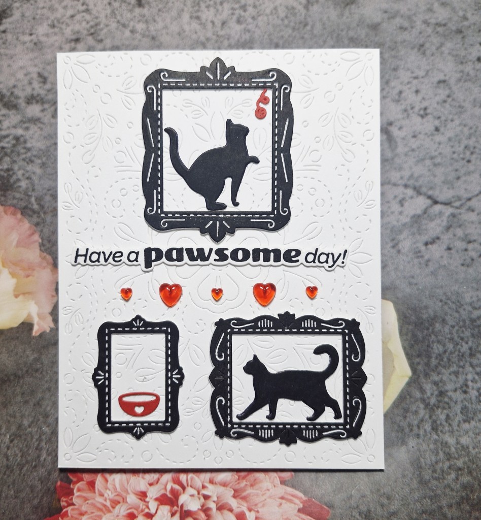
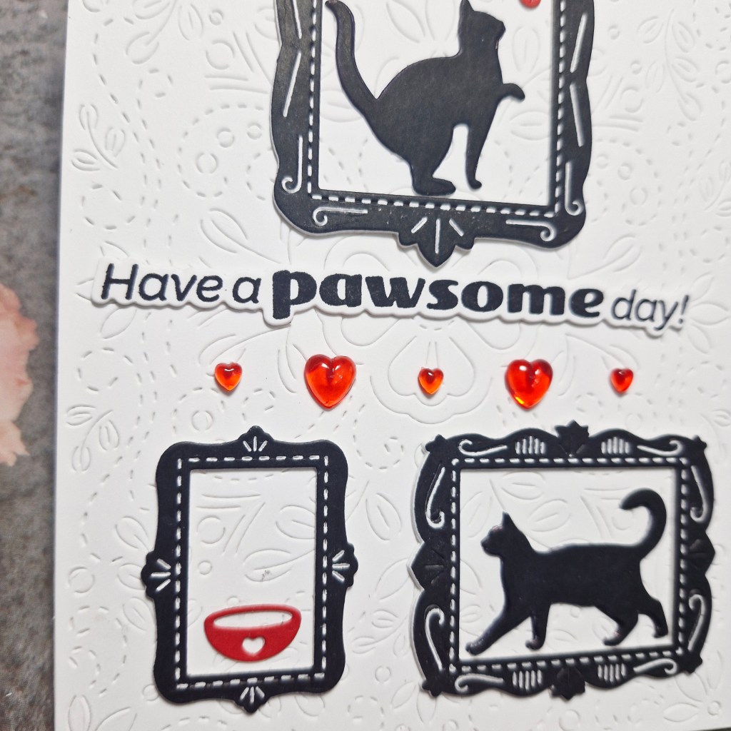
I began by stamping two of the images from Waffle Flower Crafts ‘Postage Collage Cat Silhouettes’ and die cut them with the matching die. I then stamped the picture frames to match the size of the cats I had chosen, then die cut them out.
All of my die cuts are layered three times, as I like stability and dimension.
I then die cut the bowl and the ball of string in red card stock.
The background panel is from Pinkfresh Studio, a cover plate which adds floral stitching ‘Charming Stitched Florals‘.
The panel was glued to a white card base, then the frames, cats, bowl and ball of string were placed.
The sentiment is also from Waffle Flower – stamped then die cut, layered once again.
I wanted some additional red, so I looked through my bling stash and found these hearts – I think I received them in a packet for a virtual event at some point – so added them as you see.
I shall be entering the following challenges:
Colorful Options – black and white, option taken for a pop of colour
Hello once again. The Alphabet Challenge has started another round of the Alphabet. Billie A has chosen the theme:
A is for in the Air
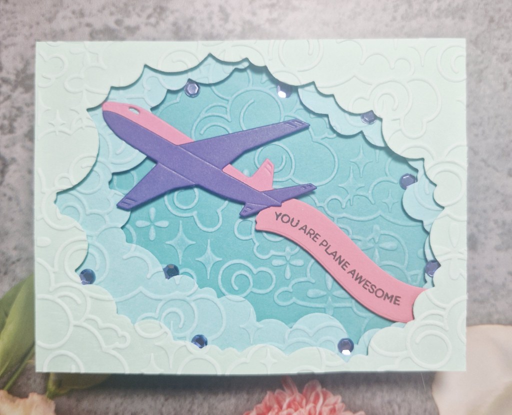
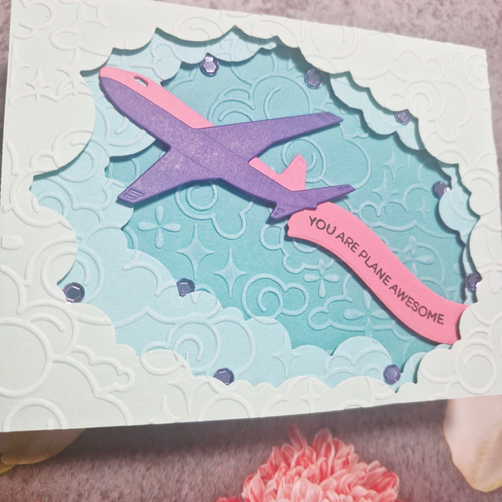
Here is my card:
I made this card as our God Son has been accepted into the WWE world in the USA, and is going to their training camp in Florida. What an achievement for him. We wish him all the best in the world.
I started by creating the plane from a Spellbinders die set – Fly Away – then hunted for a flowing banner, which I found in a Heffy Doodle set ‘Flying High‘. The sentiment was stamped then die cut with the banner die.
I wanted lots of details and some dimension for the scene, so I also used the Spellbinders die set called ‘Tunnel Clouds‘, and three different shades of blue card stock, playing with the placement and ararngement a little to create a large enough area for the plane and banner to sit in.
When I first put the layers together, they looked a little ‘plane’ (forgive my pun……) so I then a Spellbinders embossing folder on all three layers called ‘Cloud Nine‘, lining up each of the three layers so the pattern ran across seamlessly, then took my white pigment ink pad and gently ran it across the top to highlight the raised areas.
The final step was to add some sequins, because I saw no reason not to really…….added bling for an up-and-coming international wrestler……!
I hope you can come and join us with your creations following our theme. There are lots of options to be able to create, as you can see from the DT inspiration. xx
I shall be entering the following challenges:
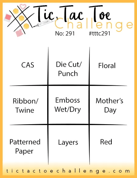
Tic Tac Toe – middle column – die cuts/emboss/layers
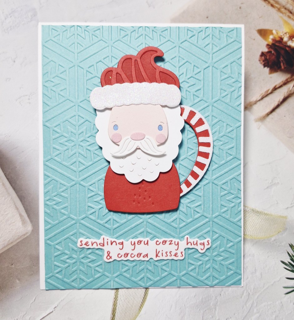
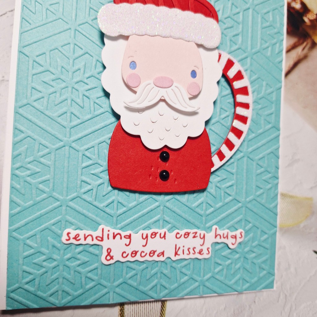
I created a card inspired by the challenge at 52 CCT, where the current theme is Christmas and Mug:
I started by die cutting and assembling the Spellbinders Santa mug from the die set called ‘Cocoa Greetings’. You do have the option of creating a penguin and deer also – but I was feeling that Santa vibe.
Once assembled, I took a piece of a light teal blue card stock and used a Spellbinders embossing folder to create a snowflake background, stamped the sentiment – also from Spellbinders, and die cut that with it’s matching die.
I added some small black gems for the buttons on his tunic.
A fairly straight-forward card which came together quite quickly, once I had decided on the colours.
I shall be entering into the following challenges:
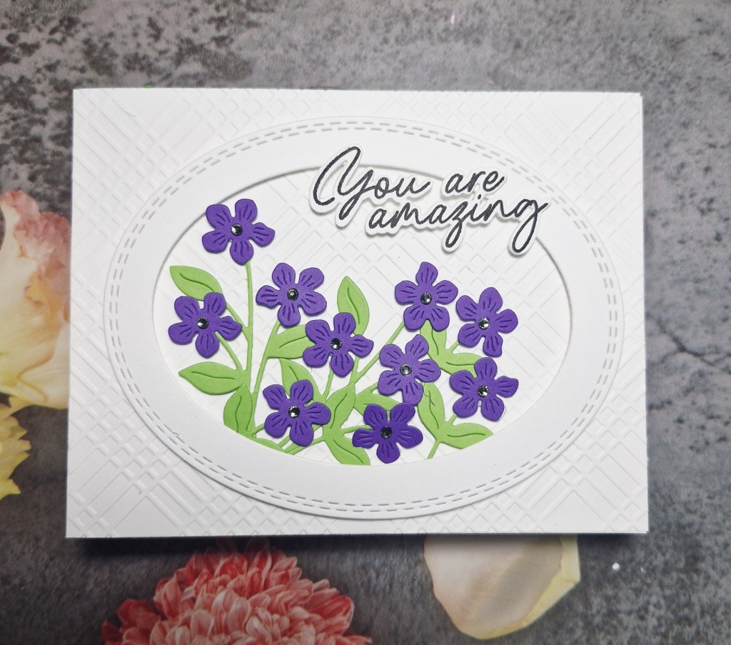
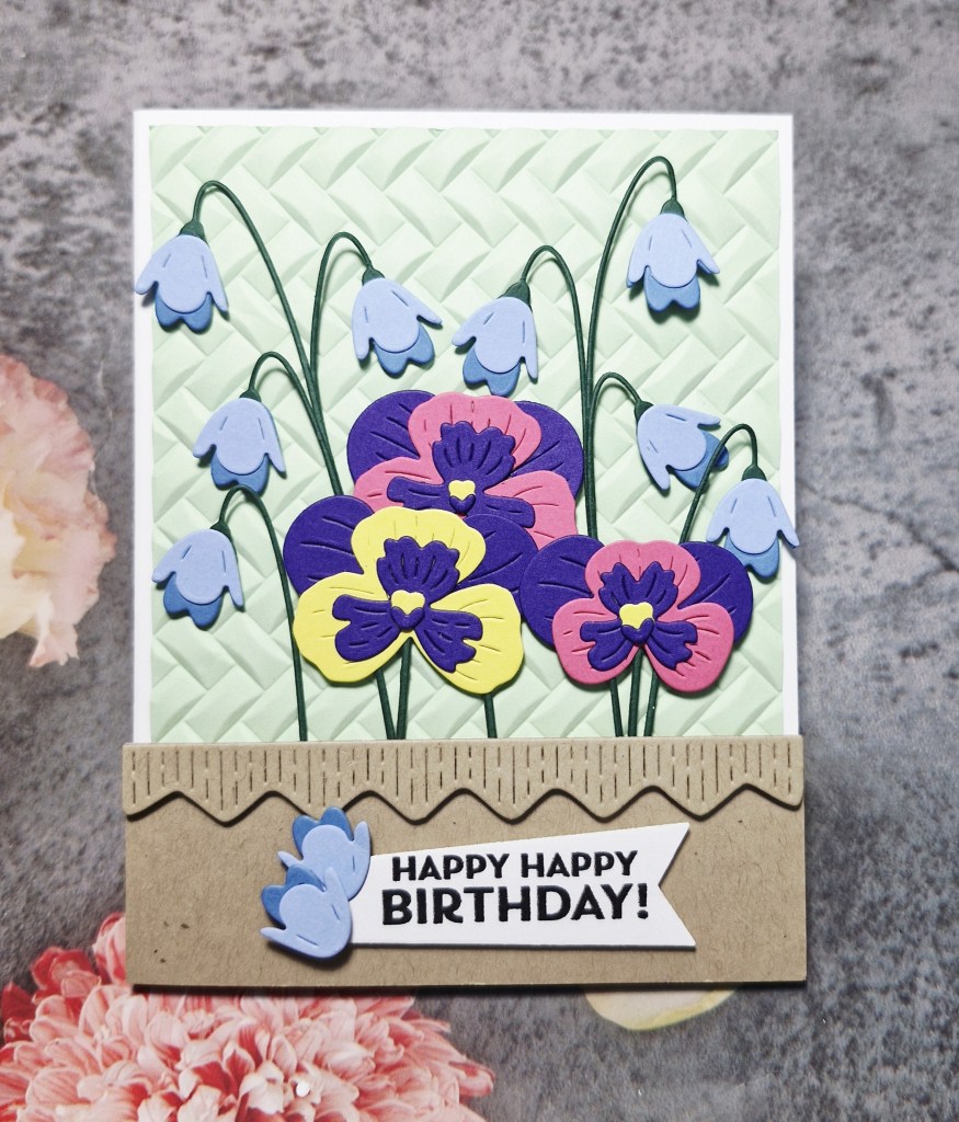
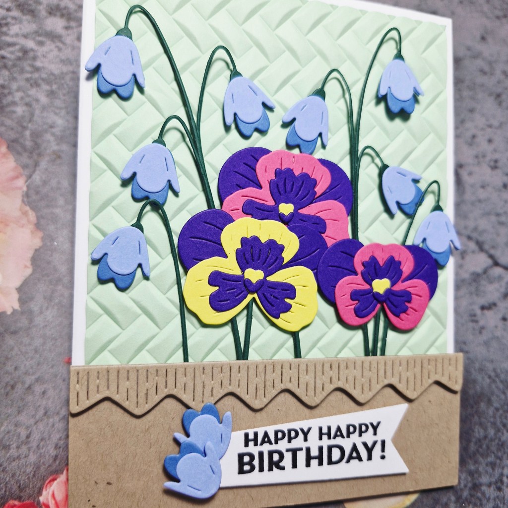
Hello again. I have a birthday card to share using some new products from Spellbinders:
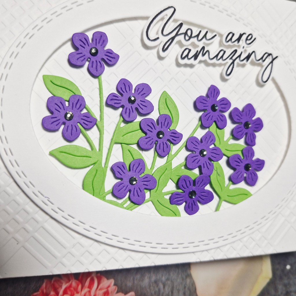
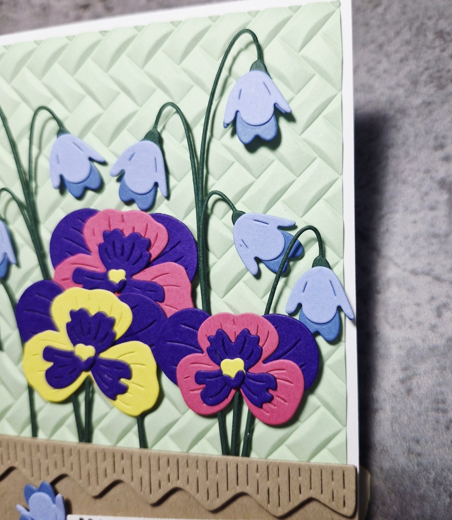
There are a couple of challenges calling for Spring themed cards, so I used the new dies from Spellbinders which included these bluebells and pansies, and some bright card stock off-cuts I have handy.
I first cut and layered the pansies, then the bluebells, adding the stalks. The bluebell stalks hold one flower, but I layered three together to create several which dangle from the same stem.
The background panel was created using an older SIzzix 3D embossing folder and trimmed down slightly.
The bottom light brown/Kraft section was cut, and then the border added so it looked like a window box.
The flowers were arranged, then stems tucked beneath the brown section, with 3D foam behind each flower head.
The sentiment is from Pinkfresh Studio – stamped then die cut – and two of the spare bluebell flowers attached to the side.
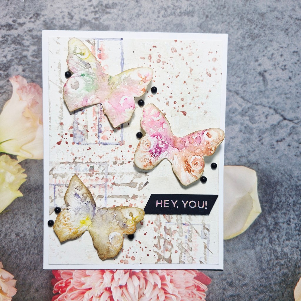
Hello everyone. I am here to announce the new challenge starting at The Alphabet Challenge. We have reached the letter ‘Z‘, and Deborah has chosen the theme of:
Z is for Zoology
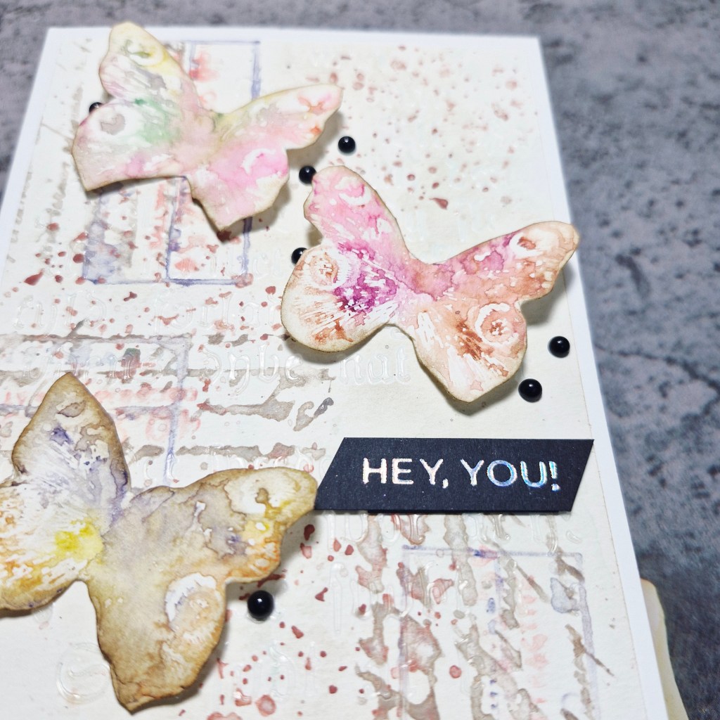
Here is my card:
As you can see I chose butterflies, which – according to Google – are classed under the order of Lepidoptera.
I started by grabbing the Tim Holtz/Stampers Anonymous red rubber stamp set called ‘Flutter‘ and chose to go down the mixed media path.
I first grabbed my Distress Pencils, some water, and then coloured each butterfly stamp with the wet pencil nibs in a selection of colours, applied a spray of water to that, then stamped.
This gave a water-colour pattern, not precise, which is what I was going for. After that had dried, I fussy-cut them out…..yep, me, fussy-cutting…….!!
Now for the background panel.
This was created with a piece of Distress watercolour card, some script stamps, Distress pencils – using the same wet pencil to stamp technique, and stamped a couple of times.
This was left to dry whilst I hunted out more stamps I could use, and found a label stamp on which I used a light purple Distress pencil – same technique – wet nib then spritz.
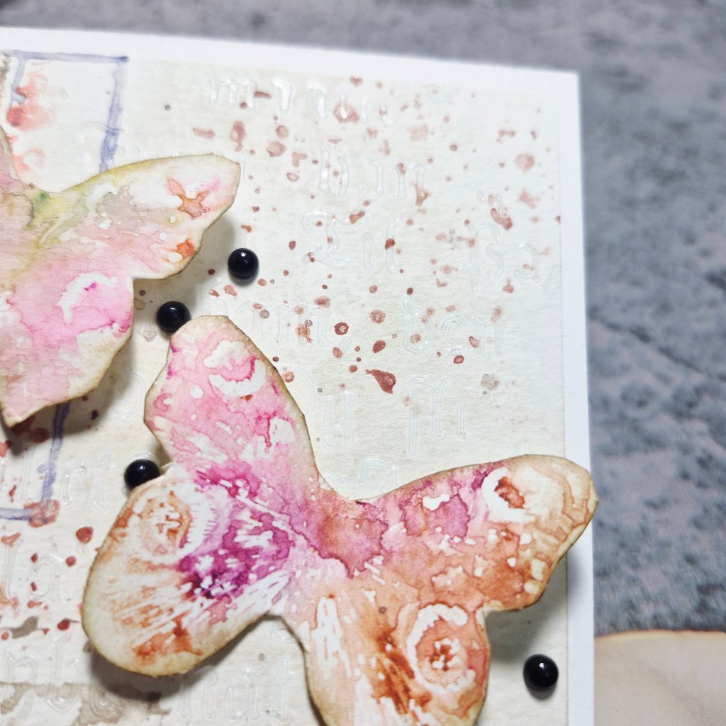
Once the panel was dry, some splatters applied and left to dry – again.
I then used a stencil from Finnabair ‘Gothic’ script and some clear embossing paste – you can see a slight shine in some parts on the background.
Once everything was dry, I attached the background panel to a white card base, created a little curve in the butterfly wings and attached with glue – 3D foam under each wing to maintain dimension.
The foiled sentiment was added – silver on black – and little black gems stuck down as you see.
I hope you can come and join us with your projects following our theme. xx
I shall be entering the following challenges:
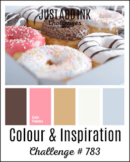
Just Add Ink – inspiration & colours – pink, brown – light and dark, white,
Hello there. Cardz 4 Galz has started a new challenge. Sue J is hosting, and she has chosen the theme of:
April Showers
Here is my card:
I decided to go slimline with this card to get more umbrellas on there, so I created the background panel using a Clearly Besotted stencil, Versamark ink, and silver embossing powder. I had to move the 6 x 6 inch stencil to cover all the background panel – but it worked out well.
The rainbow umbrellas were created using a Spellbinders die set, ink blending a slightly darker colour for the under-side of each umbrella, and adding the lacy layer – ink blended to be slightly darker – for a little more interest and dimension.
The sentiment is from an older Avery Elle stamp set – stamped then cut into a rectangle.
I hope you can come and join us with your creations following our theme. xx
Hello there. I have a card to share using a pale pink and pale blue:
My starting point for this card was to use the images from Pinkfresh Studio, products from the recent SCT event. The stamp set is called ‘Delicate Whispers‘ and comes with four of the floral images in one stamp, so I stamped twice using a brown Gina K ink instead of black for a softer outline.
Once stamped, I ink blended the light pink and light blue Pinkfresh Studio inks, then die cut with the matching die. I die cut another layer to place behind for more stability – each floral image layered twice.
I wanted to place several of the images on a card front, so I then used the Waffle Flower ‘Postage Collage Blocks’ stencil to shade each block with both of those colours.
The sentiment was stamped – from the same Pinkfresh Studio stamp set – then the panel adhered to a white card base with 3D foam.
Each of the images was glued down, and then some light blue sparkle gems from Spellbinders added here and there.