Hello everyone. The Alphabet Challenge is starting a new challenge. We have reached the letter ‘O’, and Helen has chosen the theme of:
‘O is for Oval and One word sentiment’
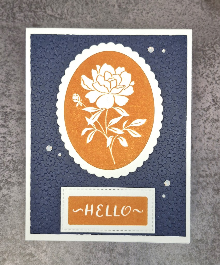
Here is my card:
For this card I chose to use the Press Plate from Pinkfresh Studio ‘Oval Blossom‘. I first used orange ink for the press plate, which colours the outside of the blossom image, then used the oval die and scalloped die which comes from the same set.
The sentiment is also a Press Plate from Spellbinders, inked with the same orange die cut with a stitched rectangle die which would leave a white edge to match the scallop on the floral image.
The background navy panel was cut slightly smaller than an A2 card size, and dry embossed using a very, very old embossing folder, which I believe is from Darice.
The final touch was to add some pearl gems to some of the background flower centres.
I hope you can come and join us with your creations following our theme. xx
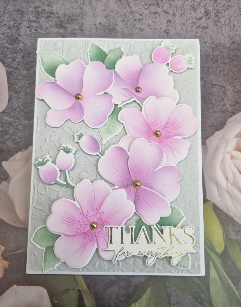
Hallo. Cardz 4 Galz has started a new challenge. Pamela is the host, and she has chosen the theme of ‘colouring‘. Here is my card:
For the floral images, I decided to colour them using ink blending. This die and embossing set is from Altenew, and I think it was part of a virtual event. I must have ‘filed’ it somewhere safe, because I cannot find it again at this point….
I first used the die set to cut the images out, but taped them back into the card it had been cut from to make ink blending easier. I then used the matching stencils to colour each of the images, using some shading and certain places for added dimension.
I then placed the die cut in the matching embossing folder and ran it through my machine – this certainly adds even more dimension and detail.
The background panel is using Spellbinders ‘sage’ card stock and also ran through an embossing folder.
The final touches were to add the gems for the centre of the flowers, then a gold foiled sentiment.
I hope you can come and join us with your creations following our theme – there is a lot of scope to be able to include colouring on your projects. xx
I shall be entering the following challenges:
Stencil Fun – use stencils – option of Halloween related not taken
CYHTP – embossing folder – option of pumpkins or orange not taken
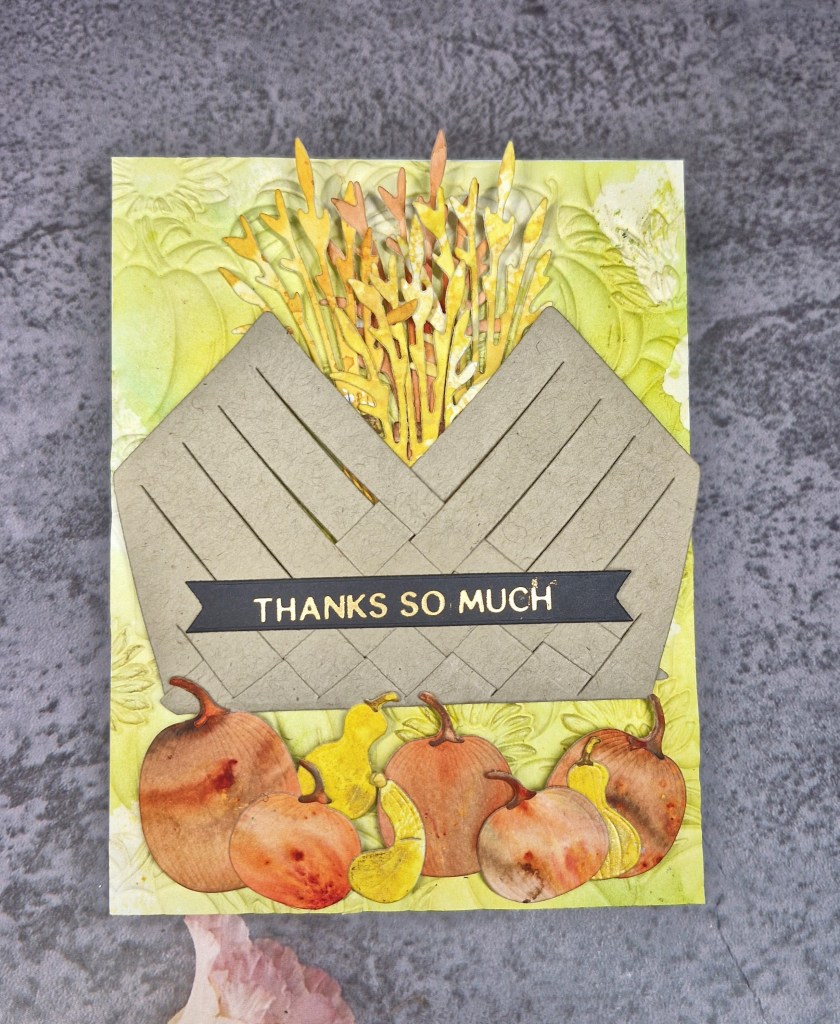
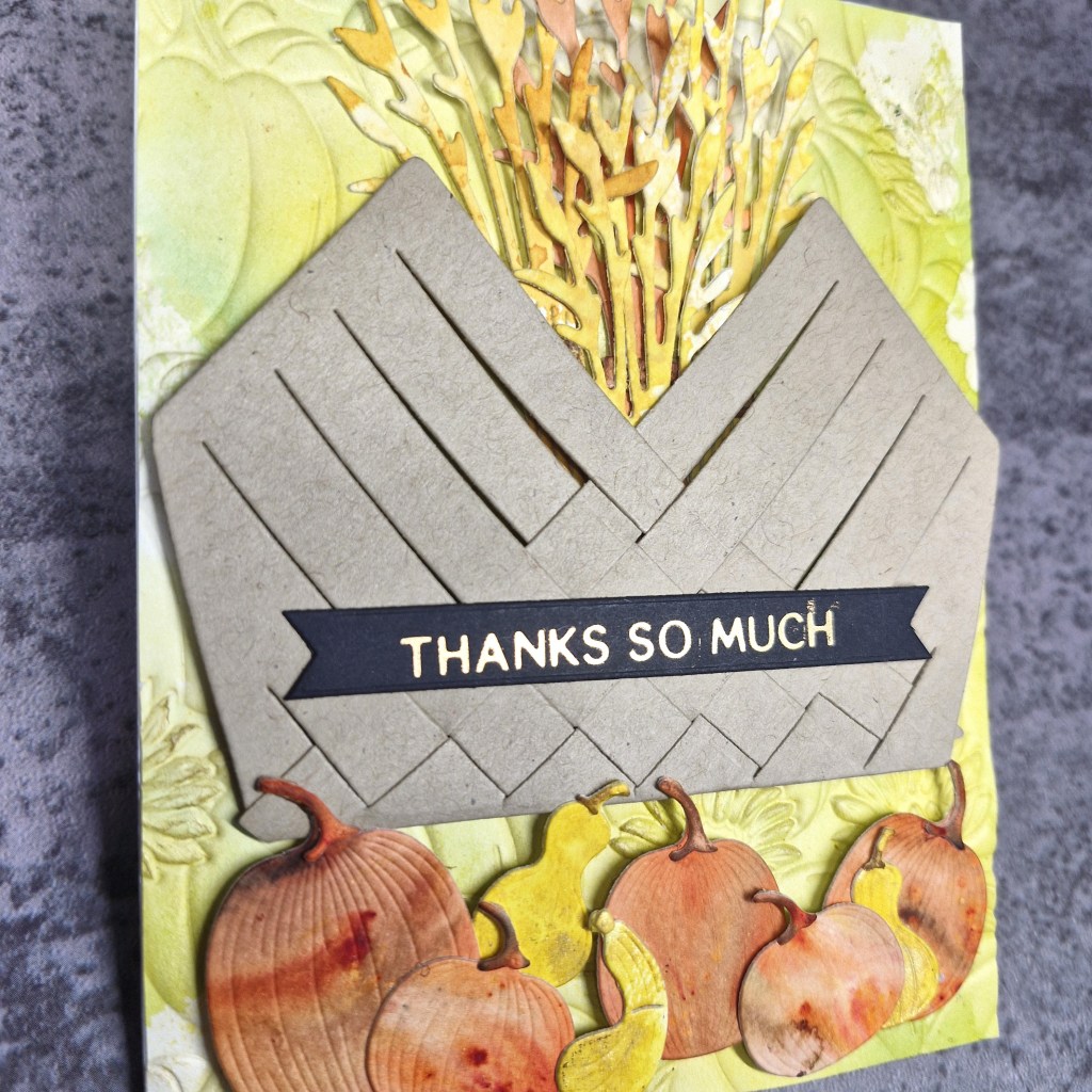
This card was firstly inspired by the current challenge at Inspiration Station. I was looking at the colours with the basket full of harvest goodies.
I took the opportunity to raid my stash of pre-prepared papers and card from ink smooshing and spraying and spritzing, using Brushos – generally from one of my play sessions.
I found the orange piece and die cut some pumpkins using a die set from The Greetery. I also found a piece of yellow card from playing with some mica sprays – the smaller pumpkins were die cut from that. The sheaves of wheat were die cut from more mellow orange and yellow pieces.
The basket is also from The Greetery – ever used – and that was just from some plain light brown/Kraft card stock – letting the other elements shine.
The background panel was created using a piece of paper I had gel printed on – I was obviously playing with some light green or lime inks and paints, and that piece was cut down to an A2 size panel, then a Spellbinders pumpkin embossing folder used on it, after which I took some bright ink and lightly blended over the top – catching the details subtly in some areas.
Now all my elements were ready, I glued the background panel onto the card base, played around with the layout, then added some 3D foam pieces to the back of the basket, inserted the sheaves of wheat, then stuck down.
The pumpkins were added with a mixture of 3D foam and glue.
The sentiment is gold foiled – again from a previous crafting and foiling session – black strip to make it stand out amongst all that colour.
I had fun creating this card – so many mediums I have previously played with, creating a stash I forget to turn to – but I was also inspired by one of my Design Team buddies who had recently produced a card using stuff in her ‘bit box’ – and so reminded me I had a stash of papers and pieces of card from all my sessions playing with inks and paints and gel plates etc… I really must remember I have them….
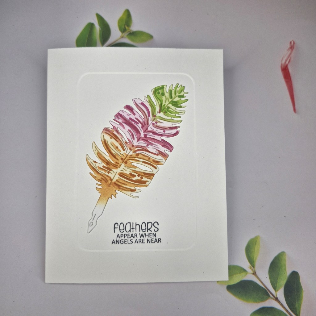
After my die cutting saga yesterday, I decided to try my hand at a more CAS card today:
You know that CAS is not my usual style, and I actually find this style more challenging, but I was inspired by the current challenge at CAS on Friday, as their theme was ‘feathers’ and I just love this die and stencil set from Waffle Flower Crafts.
The card base is an A2 side folding – my choice is asked – and into that I embossed a rectangular frame using Clarity Crafts embedders. I really, really need to practice this technique, as I failed on the first card base – a couple of panels to use later – but I do like the effect. It adds a little something-something without adding too much detail or dimension.
I then stamped the sentiment from a Clearly Besotted stamp set directly onto the card base, at the bottom of the embedded rectangle.
The feather was die cut, placed on my grip mat, and the colours from the Color Throwdown used – lime, pink, then orange – using Pinkfresh Studio inks.
The two layers for the stencil set first does the lighter details, whilst the second layer does the darker details, and after those two were blended, I went back over very, very lightly with the same inks to make the background white on the feather less harsh.
I decided to keep the nib of the feather pen on there, but did ink down a little with the orange, then glued directly into the embedded rectangle.
So – no gems, no jewels, no 3D foam tape – my goodness – I must get back to doing that tomorrow…..!
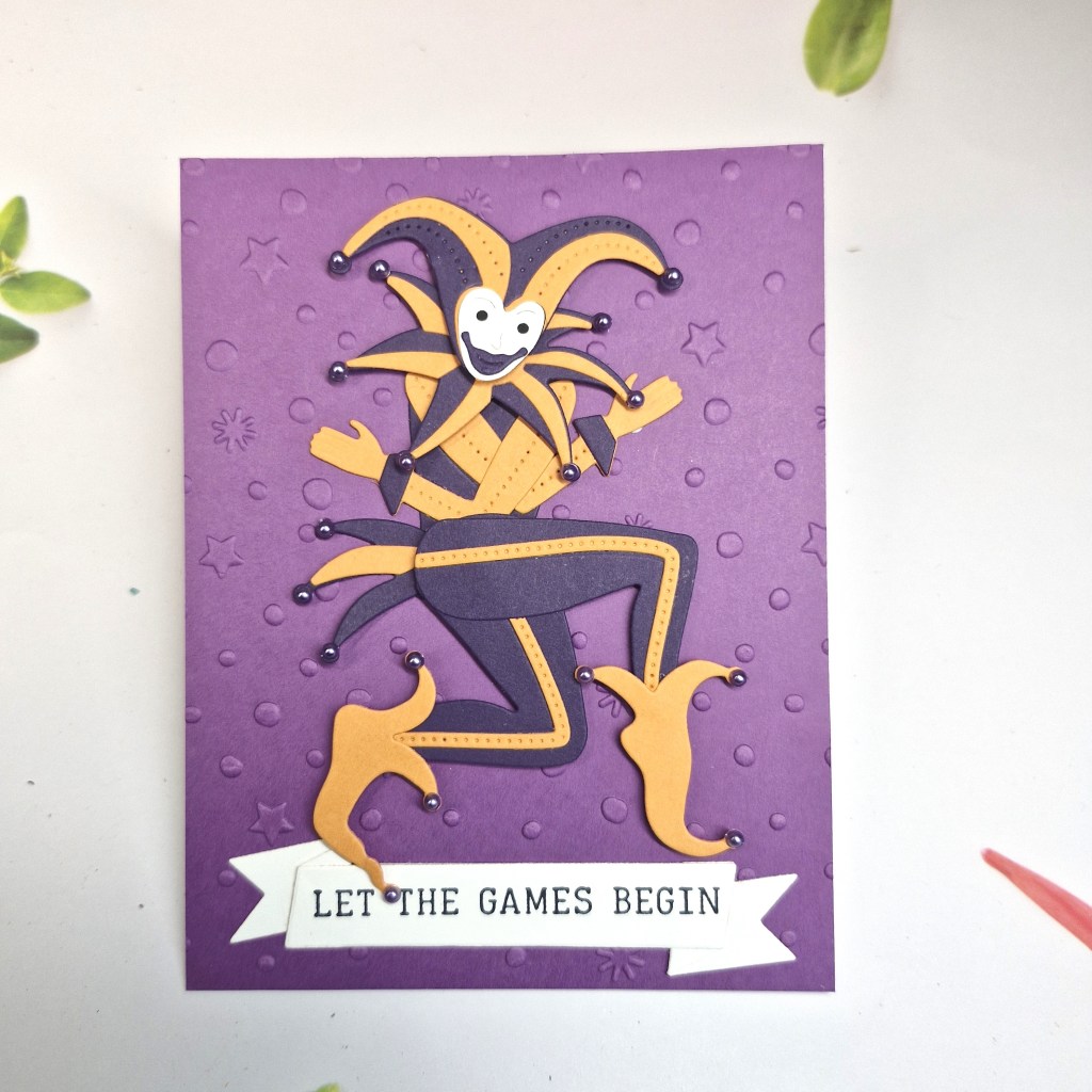
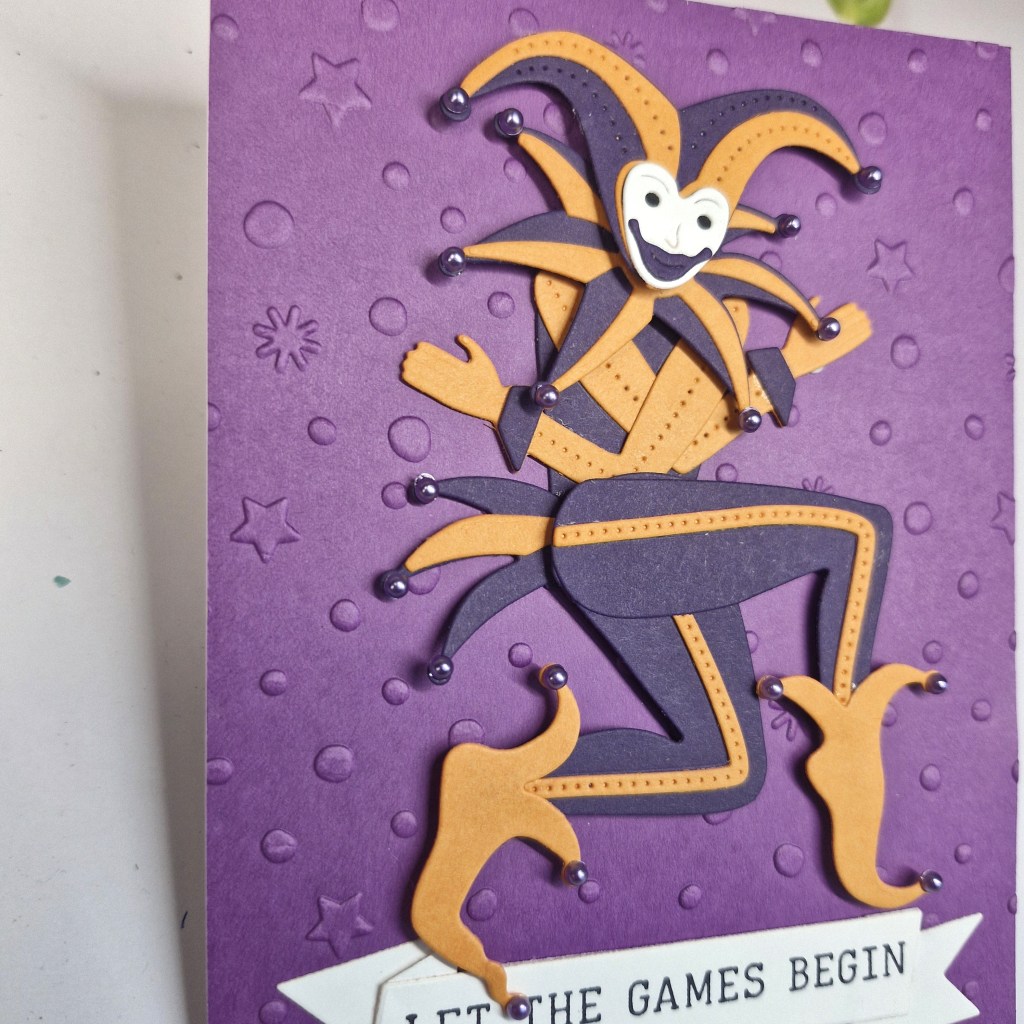
I have a card to share inspired by the current colours for the Color Hues challenge – and I took the opportunity to add other elements for some other challenges:
I have this die set from Spellbinders for quite a while, though I did have to wait for the re-stock initially, and have been waiting for the chance to use this fun set.
The colours for Color Hues are ‘orange and purple’, which I thought would be perfect colours for this joker.
I die cut the elements required for him from Concord & 9th card stock – minus the stick thingy he holds – and started gluing each of the layers together, body part by body part. I then assembled him, adding some small 3D foam in certain places for more dimension – the legs, the head for instance.
I then though about what to do for the background……I tried a couple of ways first – which didn’t work and were too busy for this chap – and whilst searching through my stash came across this fun embossing folder – just some subtle starts and bubbles – and thought it would work.
I used a different colour C9 card stock:
The sentiment is from Spellbinders and is a Letter Press plate which was with the same release, picking the sentiment I thought was fun, used my letterpress for it, then die cut it out.
This same letter press set came with the banner die – it took me a while to figure that out (!!) – but I managed – only one small piece of card to throw away when I did it wrong…
I glued the background embossed panel to the card base, added the joker with a mixture of 3D foam and glue – he was all different levels due to my use of 3D foam when assembling him, then added the sentiment.
As a final touch – you know I like my gems – I added some small purple ones to each of the parts of his outfit where I thought bells would be if he was a proper joker or court jester.
All-in-all – having fun with the die set, a couple of oops moments, but smiles mostly…
Cup Cake Inspirations – what makes your smile – card making, even making some errors, playing around generally to create a card – and the card itself has made me smile)
CYHTP – embossing folder – option pumpkins or orange
Hello. I had time to craft and create the following card today:
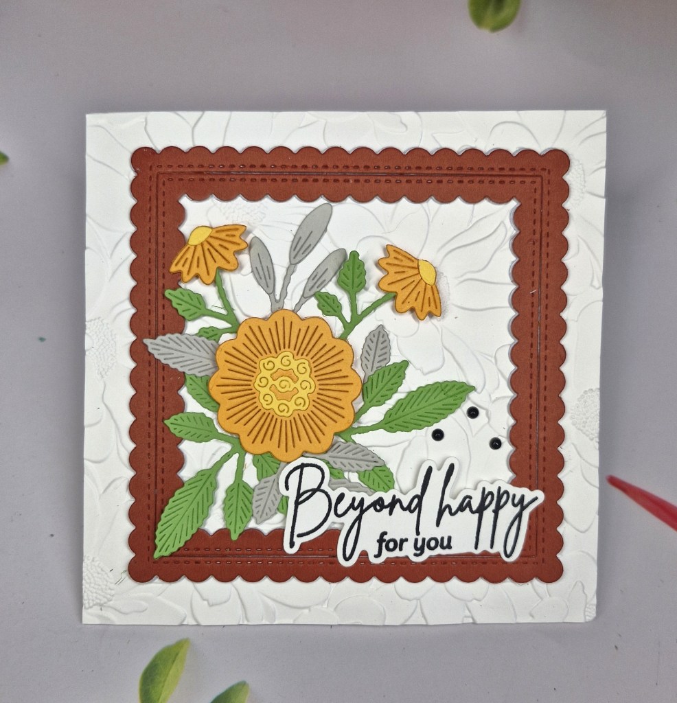
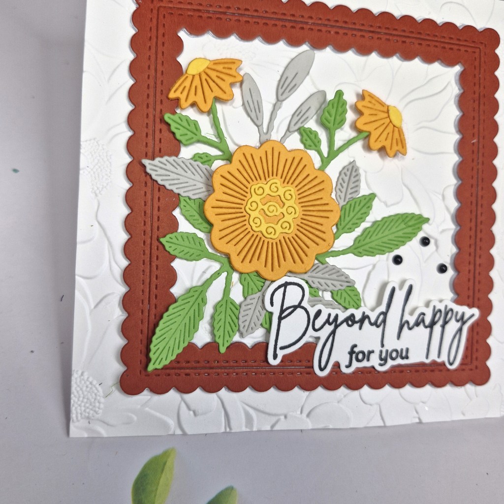
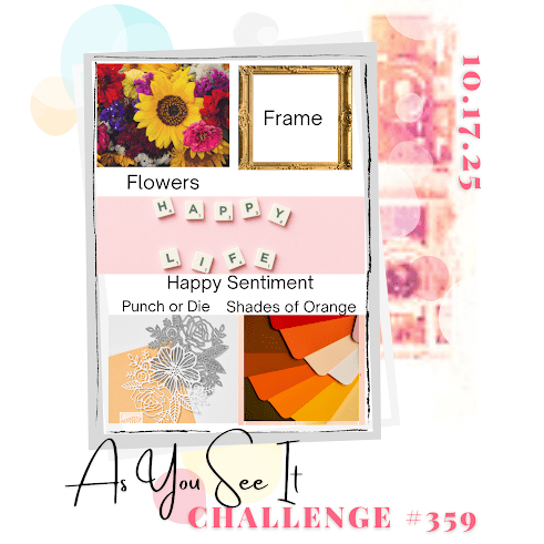
I was intrigued by the current recipe for the As You See It Challenge and decided to see what I could come up with – flowers, frame, happy sentiment, punch/die, shades of orange.
I began with choosing some flower die cuts from The Greetery ‘Embroidered Blooms‘ – and cut the elements from tones of orange, some green, grey, and yellow for added interest.
I then chose a frame die set from Pinkfresh Studio, and used ‘Cayenne‘ card stock from Concord & 9th, adding a couple of white layers beneath for dimension, rather than using 3D foam.
Arranging on a 5×5 inch card base to align with the square frame, I felt the background was a little too plain, so I used an Altenew embossing folder ‘Daisy Bed 3D‘.
This embossed panel was glued down to the card base, the frame added, then the florals arranged.
The sentiment is from Pinkfresh Studio, stamped and die cut with the matching die. I chose black for a little more drama, and even added three little black Spellbinder gems – I do like to use gems….
A smaller card and a different size than my usual, but I think it is quite cute – if I do say so myself…..
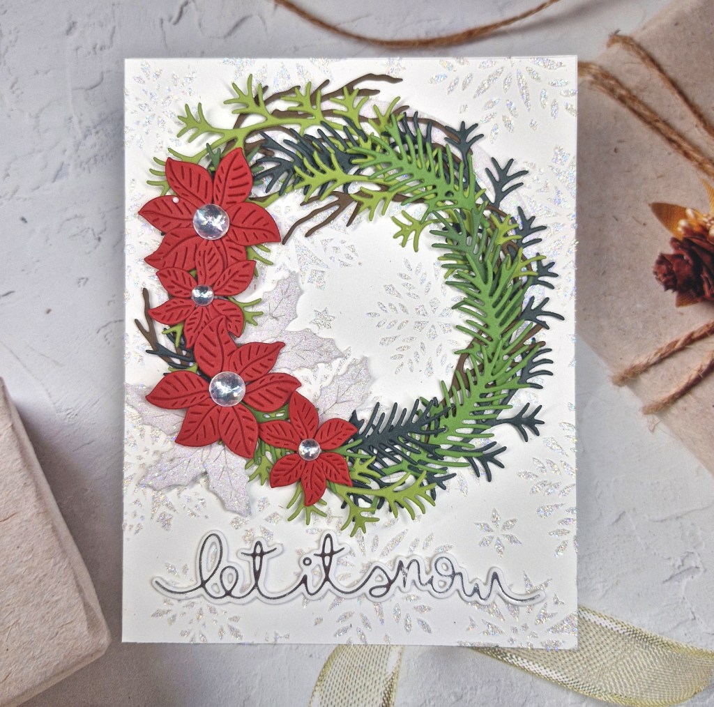
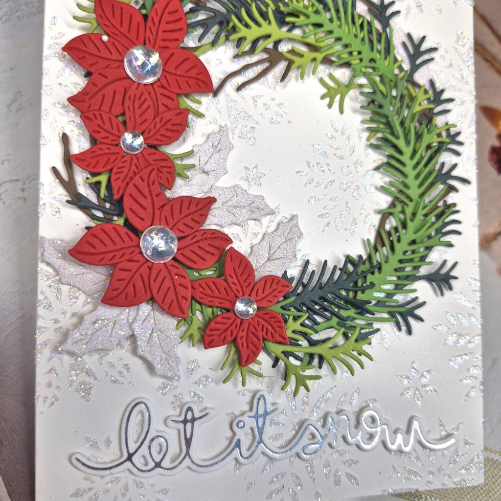
Hello everyone. I have a card to share that I have been procrastinating over for the past few days. I finally managed to decide on how I wanted the wreath to look:
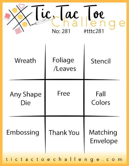
The starting point for my card was the top row of the current challenge at Tic Tac Toe – wreath – foliage/leaves – stencil.
The background is using a Simon Hurley stencil received from a recent virtual event, and also using his Unicorn Horn Lunar Paste. Whilst this panel was drying, I searched through the CML app for foliage, branches, leaves, poinsettia and holly, and picked out three or four of the Spellbinders die sets I have.
I used a few shades of green for the foliage, a brown for the branch dies, red for the poinsettia layers, and I used silver glitter card for the holly leaves. Once all die cut, and the back panel was dry, I created a circle frame using some nesting circle dies and stuck that down, so I had something to follow when arranging all the elemnts.
The branches and leaves were glued down – just the tips so there was movement and dimension, then the poinsettias attached with a little circle of 3D foam, the holly leaves added lastly.
Silver gems were glued to the centre of the flowers, then the silver foiled sentiment from Lawn Fawn – stacked a couple of times – was glued down to the bottom of the card.
Lots of glitter and shine on this card, and I’m so pleased I actually managed to finish it…
I shall be entering the following challenges:
Tic Tac Toe – top row – wreath – foliage/leaves – stencil
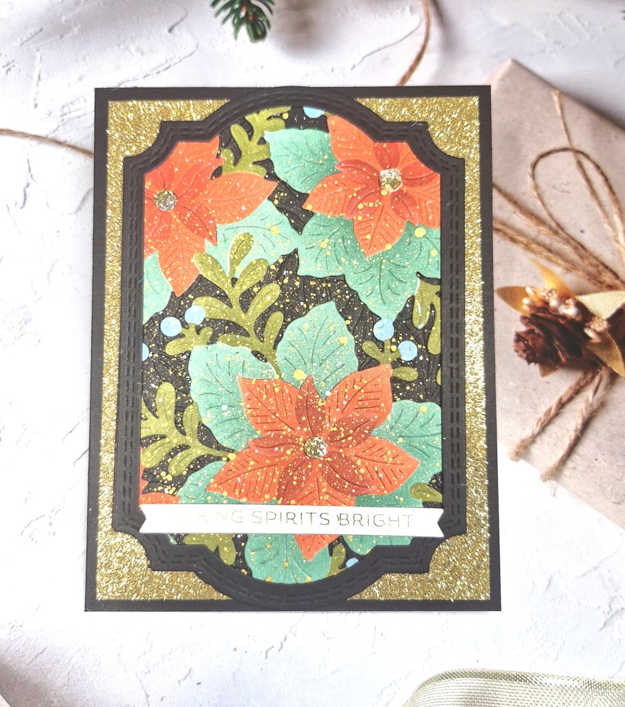
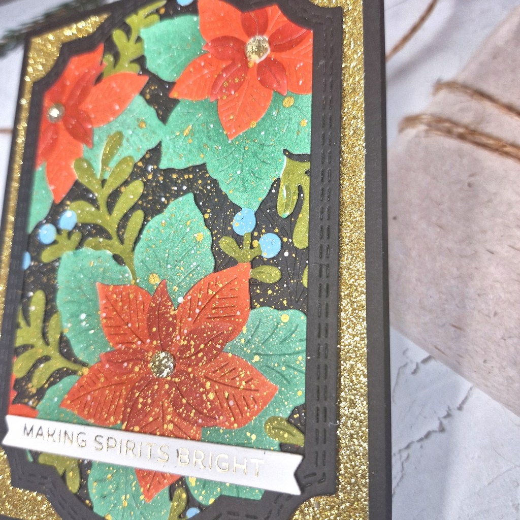
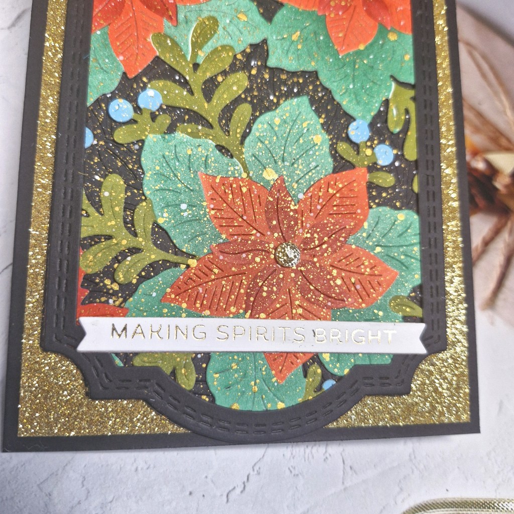
There’s a lot of glitter and shine with this card, and I’ll try and show you on the following pictures.
To begin, I started with the Pinkfresh Studio ‘Whispers of Poinsettia’ die and stencil set. I started by using the stencil and ink blended all the layers with different coloured inks, then used the matching die to cut it out.
To add more drama, I used a black panel and cut to an A2 card base size, then used another Pinkfresh die set to cut the frame out of black, and used an embossing folder for the cut out portion of the frame. The poinsettia panel was also die cut with the larger of the frame dies, placed behind the frame, the black embossed panel added behind, and then I added some splatters that with some gold shimmery acrylic paint from Liquitex.
When I say ‘some’ splatters – I kinda went to town with it….
A gold glitter card stock panel was cut, and all the layers added with wet glue.
I added a foiled sentiment and them some ombre glitter gems for the centre of the flowers.
I hope you can come and join us with your Christmas creations xx
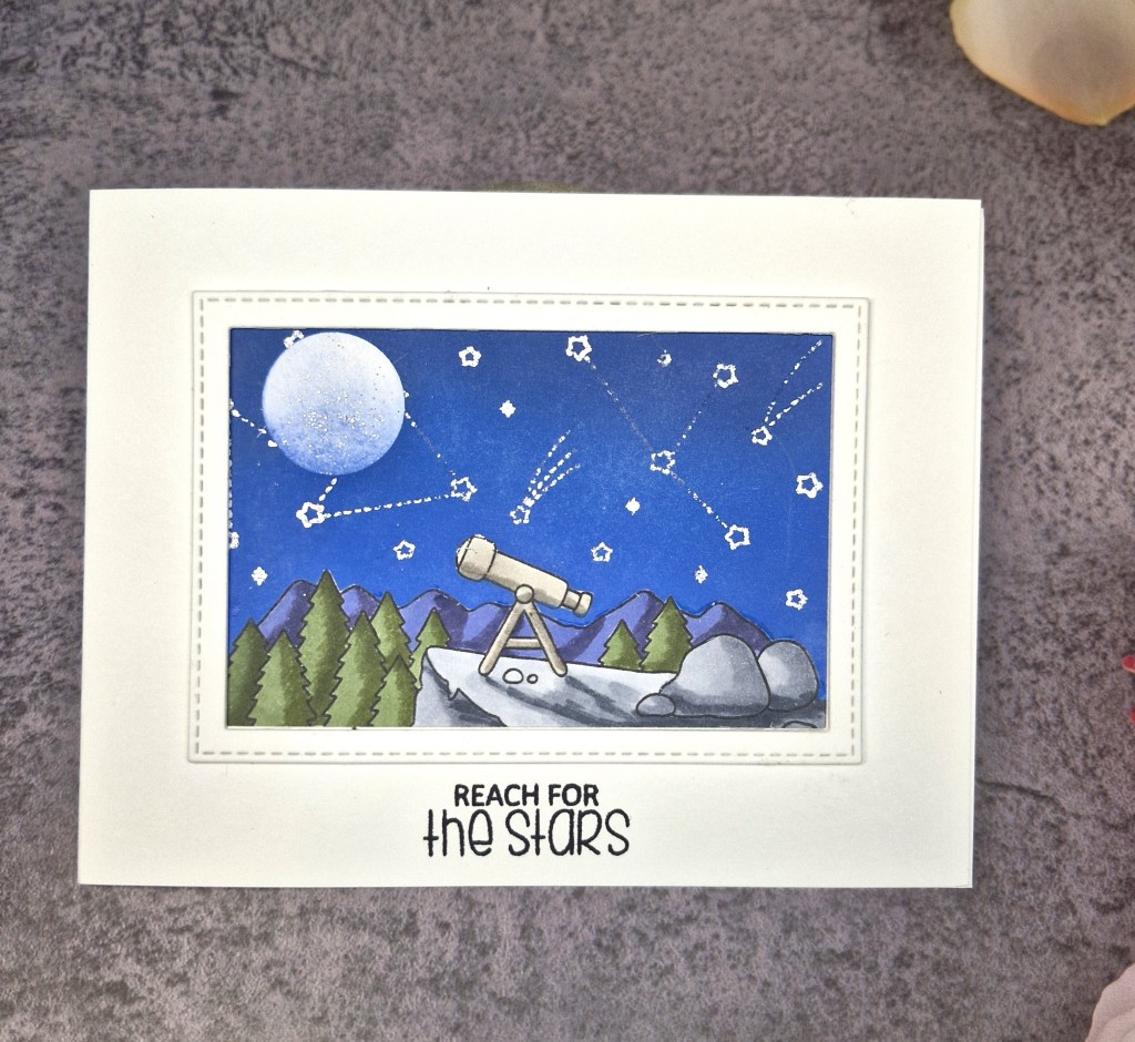
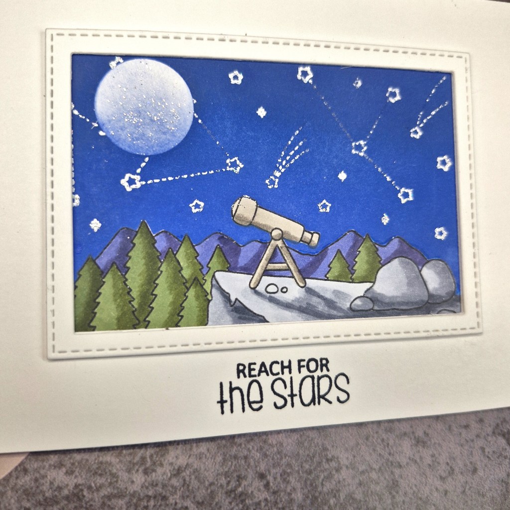
Hello everyone. The Alphabet Challenge has started a new challenge. We have reached the letter ‘N’, and Pamela has chosen the theme of:
‘N is for Night‘ with some ideas such as clouds, moon, sleeping image, stars etc
Here is my card:
I decided to break out my Copics to colours this scene – I’ve not used them in a while.
The images is from Clearly Besotted, stamped with alcohol friendly black ink. I use Gina K Designs Amalgam for this.
I then used a range of tones for the colouring of the image, before stamping again and fussy-cutting around the sky line – yes – me – fussy-cutting!! – to create a mask. This mask was placed over the image and another small circle of the masking paper created for the moon.
I used some Distress Oxides and ink blended the sky, darker at the top edge. The moon mask moved during one of my swiping of the blending brushes, and some of the ink got into the moon area – but that was certainly a happy accident as it made the moon look more realistic….
Once ink blended and the masks removed, I used a heat tool to dry completely ( so I thought) and used the star detail stamp and used a white sparkle embossing powder……another happy accident was that I hadn’t actually full dried the moon area, so some sparkle landed on there – again, I liked the look of that so left it as it was.
I created a rectangle frame using a couple of dies, one with a stitching detail, then glued the coloured image and the frame to a white crad base.
The sentiment was stamped as you see.
So – a card with a couple of minor hiccups – but all came out good in the end….
I hope you can come and join us with your creations following our theme. xx
Hello once again. ABC Christmas Challenge has reached the letters ‘U’ and ‘V’. We have the Christmas themes of:
‘U is for Uncluttered’ & ‘V is for Vertical’
Here are my cards
U is for Uncluttered
V is for Vertical
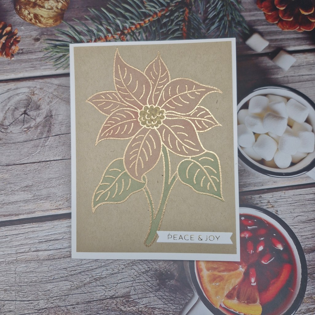
For the first card, I used the ‘Sketched Poinsettia‘ from The Greetery again, and gold heat embossed the image onto some Kraft card stock, using just the one layer of the layering stencils to colour it in. I wanted a softer overall feel to this card. The panel was cut slightly smaller than A2 and attached to a white card base, with the foiled sentiment attached as you see.
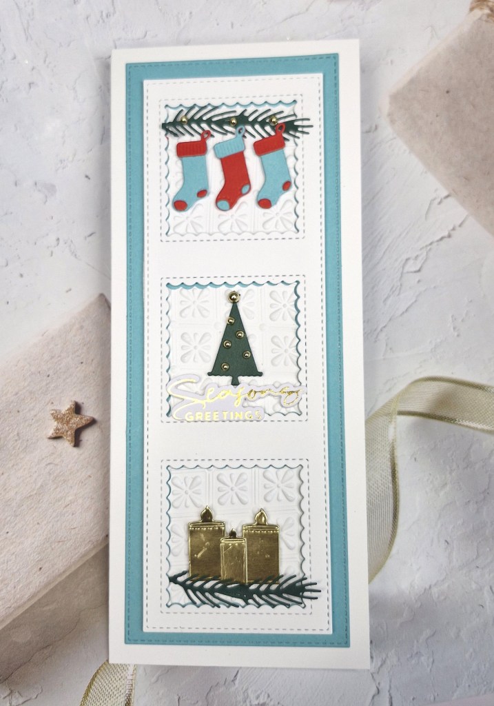
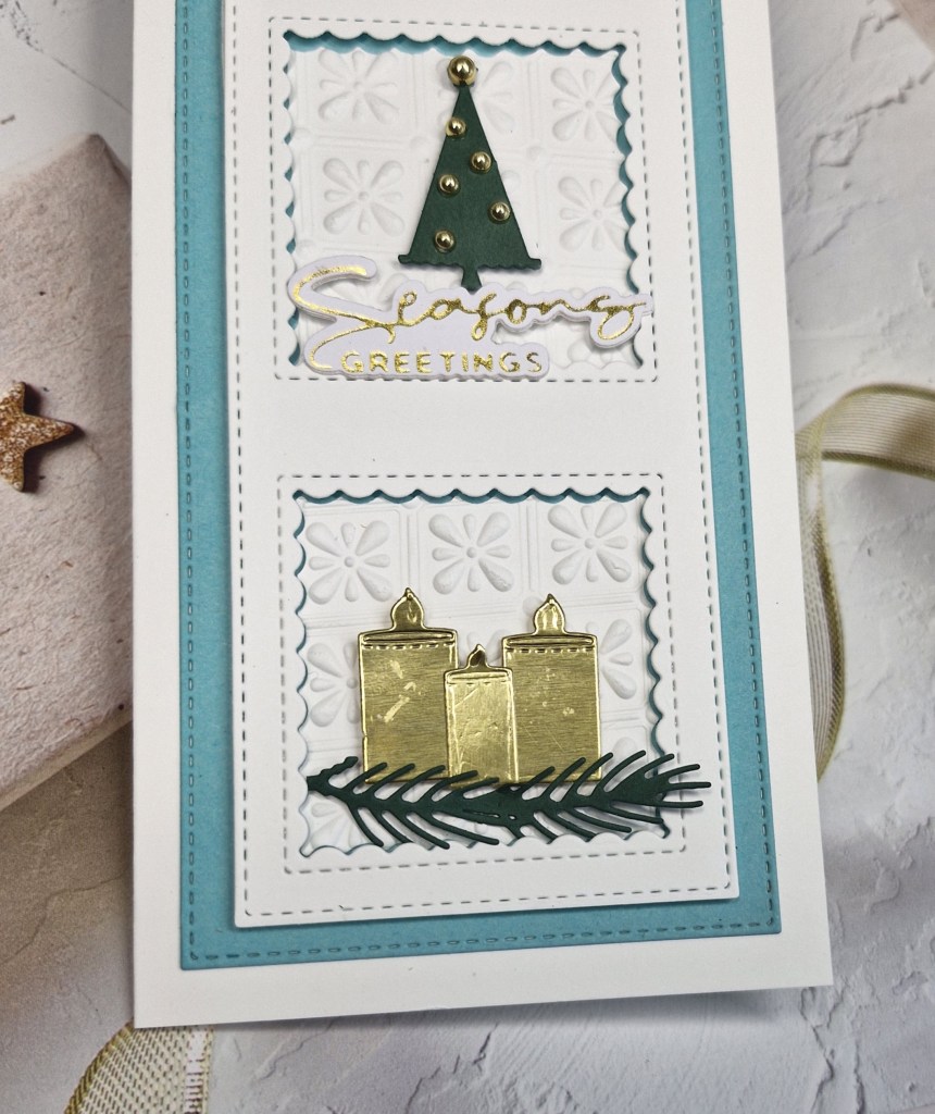
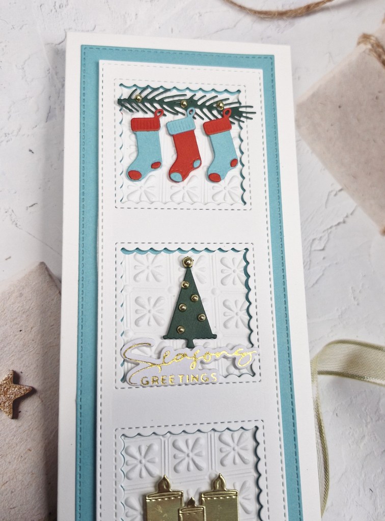
The second card took a little more time and planning.
To cover the vertical aspect of the challenge, I used a slimline card base. Onto that I used a Heffy Doodle slimline die set to create the blue layer, then the white layer with three windows. Each of the windows cut out a scalloped square and all three of those squares I ran through an embossing folder to create some detail, making sure the pattern was square for each of them.
The layers were attached to the card base, the squares inserted, then I used a die set from The Greetery for the stockings, and a die set from Scrapbook & Cards Today – received as part of a recent virtual event – to create the tree and candles for the bottom two windows.
The greenery was also part of the die set, arranged as you see, and the foiled sentiment was added.
I hope you can come and join us with your Christmas creations following one or both of our themes. xx
I shall be entering the following challenges:
CYHTP – embossing folder – option of trees/leaves not taken